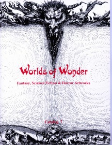
In the “as if we needed another reminder” dept., I decided a couple of weeks ago to reduce my stacks of old printed Worlds of Wonder catalogs. I’m talking dozens and dozens, going all the way back to 1995, when I first started producing printed catalogs. To my surprise, they are selling pretty well on eBay. Just as surprising, are the pangs of nostalgia I got simply from counting them up . . . and of course, peeking inside. Damn, but those were good paintings! Damn, but those catalogs were pains in the @$$ to produce! How hard was it? Let’s take a trip down memory lane . . . back to 1991. When times were REALLY different.
I didn’t always use printed catalogs as a way to present and sell art. When I first started up my business, 1991, I began with VIDEO tape catalogs. That’s right, I hired a videographer, (to film the art), a narrator (for voice over), paid an amateur musician $50. for some appropriate background music, and found a production company in Pennsylvania (the kind that duplicated and distributed marketing videos for colleges looking to recruit new students) to copy and package 20-30 minute long catalogs on VHS tape – each one featuring about 30 – 50 paintings and sculptures. Where did I get that idea? From a small newspaper article talking about the “new” way of marketing “high end” consumer goods via video tape (lap pools, cars, yachts). I thought: I need something different, and “visual”….did some research….and decided to do it. I became an art video producer.
I found my director, producer and filmmaker on the faculty at American University, where I was teaching adjunct at the time (School of Communications) in the person of Dr. Jack Jorgens, now Emeritus Professor, whose experience was largely devoted to documentaries in South American – but was up to the challenge of dealing with a neophyte and was curious enough to sign on.

Through him I found my narrator – one that didn’t sound like the guy selling V-8. I didn’t want a recognizable “voice”. And I didn’t want my own. . . either 🙂 Not only did I speak too quickly, I was the wrong gender. Yes, there is gender bias when it comes to selling. Men’s voices are perceived as more authoritative, soothing, persuasive to both sexes. And I’m practical, when it comes to business. We did the filming at my house. I got to go to the studio for the taping of the narration, and editing of the film. I wrote all the scripts. It was fun.
That lasted 4 years and resulted in 6 catalogs. People loved them. They watched them. They even bought art from me, after seeing the art on tape.. But as my business grew, I realized how limiting this method was….not only in terms of how many pieces I could offer (it was unrealistic to imagine anyone would watch a feature-length marketing film 🙂 however colorful the art!) but also where I could distribute it. I was getting requests from Europe (PAL format – which cost 4x as much to convert). So, albeit reluctantly, I switched to PAPER in 1995, with my 7th catalog. And what was fun, turned almost immediately into a DIY nightmare.

I had to find a graphic designer and a printer. I was small potatoes, and my project was unusual…just like the VHS tapes. I found my person in Judy Smith – still in business in Washington DC, who had previously helped me create my first print ads (b/w) and logo. First step: Lay out. I was introduced to the time-consuming process of producing camera -ready’ layouts for what then constituted ‘Electronic Color Separation’.
Because my catalog HAD to show dozens of pieces of art, and the source of the images had to be consistent in format, slides, transparencies, photos of varying sizes – even cover proofs, if that’s all I had to work with – had to be converted to 4″ x 6″ photos that could be glued to a sheet of flexible white poster board 22″ x 28″ that could in turn be mounted to the drum of a drum scanner . . . so that a light source could analyze the images and produce four-color CYMK separations by photographic method (later it would be pixel by pixel, and RGB).

The size of the photos was dictated by a need to show as many as 10 images on a page, two pages to a board (the more images, the more potential sales), but still keep those images sized large enough to be attractive to potential buyers (about 2″ x 3″) – at a reduction of 50%, I therefore needed 4″ x 6″ photos..
This meant a steady use of my 35mm Minolta Maxxum 7000 SLR (which cost me $750 and now is $50 on eBay, soon to be an antique) and the “right” film; had to be fast, indoor, artificial light (= Fuji Reala). I kept the local Rite-Aid and camera shop busy, and I developed a steady hand. I found a place in NY – 47th St. Photo – that sold film by the dozen rolls, 36 shots to the roll. Threading the film into the camera was art in itself, and to get the right shot I would need multiple takes. I threw out dozens of photos – because there was no way to know ahead of time which one was the “one” that would be usable. Then came the layout. .
Each sheet carried two pages of the catalog, and because this method relied on scanning the whole sheet at one time – color balance was important. One dark image too near another would bring down the color values for both pages. There was no easy way to correct them after the fact, either. Reducing the black by 2% during printing would make some images great, and wash out the others. I spent hours balancing the colors and horizontal vs. vertical images in my quest to have the art appear “pleasing to the eye”. Captions were added separately, mechanically, in the last stage, one line beneath each image. All the color pages were loaded into the middle of the catalog, and were un-numbered because I couldn’t figure out how the signatures went. People complained about having to look up descriptions of the art by number, but it wasn’t until QUARK (and me paying someone who knew how) that images and text could be integrated.
Printing and distribution were other headaches. No matter what estimate was made for printing, delivery was always late. If I was not the culprit, they were. This was a “short run” situation, never more than 500-600, could be 10% or more over or under, and it was expensive as hell. If I ordered 500, I might get 650 or 450, and the price differential between 500 and 600 made upping the order a no brainer. This has translated into dozens of extras for some catalogs, today – while I’m down to 6 total left, for others. And no matter what the proofs looked like, the final job never looked the same. When the switch came to all computer input for printing, (RGB) I hated the reduction in sharpness. Input went faster, but the output was fuzzier.
It was Labor Intensive. . . in the extreme. I tried to get the catalogs out either just after Thanksgiving or just after the New Year.

Mailing was a full time job for a week: licking and sticking live stamps, 9×12 kraft envelopes by the case, and lugging them to the post office, sack by sack. I printed labels and ordered return labels by the hundreds. I had enough art to fill two catalogs a year, but each took 2-3 months to assemble; photo, layout, print, and mail and ultimately I couldn’t do it.
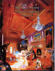
My anniversary catalogs were fun to do. I started experimenting with covers. I added in, then removed, information about each artist, or list of their pubiications. Collectors were growing savvier, more sophisticated, they knew the artists and were familiar with the names….

Life would have been so much simpler if DVDs, digital cameras, photoshop, and the ‘net had been around when I started WoW.. But what was giveth with one hand, was taketh away by the other. 🙂 By my 26th catalog I had the freedom to show larger images (only 4-5 a page now), fulll color throughout, but: it just no longer made sense to produce printed catalogs. Costs of paper and printing had gone up; it cost me upwards of $10-12K including mailing. Which translated into having to sell 15-20 paintings just to break even. Plus I had to keep artworks back “in store” for the catalog, which collectors hated. Then printing companies started going belly-up – my salesman was on his 3rd employer in 3 years. Just like magazines I had advertised in . . . gone. By catalog #27 it was time to stop, and I produced that one “online”. And soon as it came out, I realized how silly that was. I could list any art I wanted, anytime. Why make people wait? In the land of the internet, there is no need for postponing gratification 🙂
Isn’t it ironic that the tech advances that brought the end to my labors, and brought such a “boon” to me in showing and selling art – also brought the end to painted illustration? When everything is electronic, so must be the Art.









Enjoyed the read! A very interesting journey. Yes, digital leaves bodies AND opportunity in its wake. But I gotta admit, I sure miss your printed catalogs ; )