 Designing a cover is fraught with pitfalls, even for major publishing houses. If you don’t create a bespoke image, you will have to go for an abstract design or purchase an image from an online photo library.
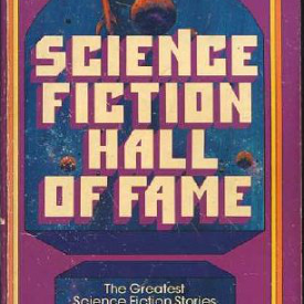
Abstract images have been a staple of hard-core science-fiction but that’s partly because the author’s name has already become a brand. The most important thing is to get that name upfront and in your face, ideally in AS LARGE LETTERS AS POSSIBLE. For an unknown, or a self-published author, an abstract image is a waste of time because it tells the reader nothing about your book.
Placing a photo on the cover has its own problems. If you create a picture yourself, it really needs to be done by a professional photographer. They will use clever lighting techniques as well as the best equipment to create a high-quality image. Although digital cameras today are very good, it can be difficult to create the sharpness that you desire. An image that looks bright and crisp on your monitor can appear surprisingly murky on the printed page.
A photo shoot organised by a professional publisher can be a very expensive business, because make-up artists, art editors, and models all come at a cost. This is why publishers often purchase images from photo libraries. There are many of these online and you can look for any image just by adding key words like ‘sword’ or ‘Ford Model T’. The most famous are Getty Images, Corbis and Alamy (my personal favourite for the breadth and range of their selection). Getty also own the Hulton Archive, a historical range which may be handy for steampunk aficionados.
Taking an image from a photo library also contains risks because we’re all drinking from the same well. It’s astonishing how often two books will purchase the same image for their cover. This happens because buying exclusive rights to a cover image can be prohibitively expensive. There is also the problem that certain images become tropes, cropping up on cover after cover.
One further point to consider when sourcing images from photo libraries is that you need to check the box marked ‘royalty free’ rather than the box marked ‘rights managed’. ‘Royalty free’ images are often lower quality and have a more limited selection, but you will only have to pay once to use them.
For my fantasy novel (to be published in July), The Adventures of Siskin and Valderan, I wanted a commissioned piece of artwork. Finding an artist was surprisingly easy. As a WordPress blogger, I follow the ‘drawing’ tag which brings up all posts with that tag on my wordpress reader. One day, I came across an image which astonished me. It was black and white and immediately made me think of Star Wars concept artist Ralph McQuarrie. It was the work of Angel Perez and I got in touch with him via email.
First of all, we discussed the project and then we agreed a fee. When paying a fee, it’s important to remember that you are not paying for just one piece of artwork. A cover image goes through a number of iterations before you reach the final stage.
Angel requested a synopsis of the plot and a description of the characters who appear. It’s not fair to ask an artist to read your whole book before commissioning an image. To make a living, any artist needs to maximise their time at the drawing board. Professionals are all too aware of this. The Judge Dredd artist Ron Smith used to set an alarm clock before starting a page of comic art. When the alarm went off, he stopped work because he knew exactly how much he wanted to be paid per hour.
The first stage of our image was to discuss the composition. I had wanted an action scene of characters battling with swords drawn. Angel had another suggestion. He proposed an image like a movie poster, and to explain what he wanted, he drew my attention to the work of Drew Struzan. That really helped our discussion because I loved Struzan’s work when I googled it, so we were able to proceed.
Next, Angel created a thumbnail to demonstrate the the layout. Angel produced two thumbnails., one with a compass motif (1) and one with dark scenery amidst the characters (2):

Once we agreed to go with the second image, Angel then moved on to the rough. This a preliminary sketch which gives us an opportunity to fine-tune the image. Depending on the artist, a rough can be a surprisingly finished line drawing or a wild scramble of scratches on the page.
At this stage, we tried out one or two drawings because there were a few tweaks that were needed. For example, the talking monkey Jackanapes didn’t have any clothes in an early rough and he also wasn’t smiling. As a character providing light relief, he needed to be more cheerful. Finally, we agreed on a rough and Angel was ready to start work for real:

With the line drawing complete, Angel worked up a value study whereby he painted the characters and added a lot more detail. A further stage was the colour study when he worked up a sketch showing how the colours would appear. This is a key stage because we couldn’t have the monstrous István the wrong colour or it would involve rewriting the whole book.

Although this process seems rather drawn out, it is vital to agree everything before the artist starts work proper. The final painted image requires a lot of investment in the artist’s time and if the image is wrong, then he or she will have to redo everything, and who will pay for their time then? Agreeing a series of stages evades any problems with the final image, which are much more costly to resolve.
Throughout this process, I followed Angel’s advice whenever he made a suggestion. Having worked with many publishers in the past, I have learned that the freer the artist is when given a brief, the more exciting images he or she produces. Angel’s final image is at the top of this page and it is wonderful.
You can see more of Angel Perez’s fantasy art on his website here.
Next time: the launch (the book will be available in July!).


Recent Comments