One of the first things you learn as a traditionally published author is that you have very little control over a great many things about your books. Cover design, format (hard cover, trade paperback, or mass market paperback), price, and even the title are not yours to dictate. These are decisions that greatly affect the sales of a book and as such they are determined by the marketing department. I don’t have a problem with this. After all, I want my books to sell just as the publisher does. They have professionals and an established track record, and as such, generally make the right calls. But here’s the thing…because of their vast experience, they may be missing out and not maximizing a books full potential.
Self-published authors are, not unsurprisingly, more unsure of themselves. They know the importance of a good cover, but how do they know if they have one or not? If you spend any time on kboards Writer’s Cafe (and I highly suggest you should) you’ll find post after post of people putting forth their covers (or a few cover choices) and asking for feedback. Inevitably they go away to return a few days or weeks later with a new batch. More comments will ensue, some tweaking is done, and in the end a cover vastly superior from the initial one will be produced.
I’m currently working on my third series. It helps to inspire and motivate me to have images (I’m an ex-artist and I think visually) while I write. So I recently did up a set of covers for all three books of The First Empire. I searched around the various fantasy artists sites and found some perfect images. The ones that fit the series the best were done by Andres Rocha. I got permission from Andres to use his images when “pitching” the book so I mocked up the covers the way “I” want them to appear. My hope is that the publishers will agree with me that they are (a) professional (b) portray the essence of the novel (c) will sell well. Of course, I would be thrilled if these were the “final covers,” of even the basis of what will become the final covers. If I end up self-publishing the series, I’ll be able to see that through. I’ll purchase the images from Andres, or commission him to do something similar but with some minor changes to make it more relevant to my books, and I’ll have what I want.
A lot has changed from when I first released my Riyria Revelations series as a set of self-published books: six books became three, titles changed, and covers that used to convey scenes from the novels morphed into those featuring the characters. Here is the before and after.
I should note that the second group is actually two series – the first three are for The Riyria Revelations and the next two are for The Riyria Chronicles, but you get the basic idea. They all have sold well and I’ve received compliments on both designs. I personally would prefer not to have characters on the covers (as I like readers to have their own idea of what the people look like), but as Orbit rightly pointed out, covers with people sell well, and the books are more about Royce and Hadrian than the world of Elan.
When I saw the Orbit covers for The Riyria Revelations I was generally pleased. Again they looked professional, tied together well to indicate a series, but I didn’t think they represented my vision of the characters, the backgrounds didn’t reflect actual scenes from the book, and there were some obvious flaws such as the fact that Royce never uses a sword. Those nits aside, I was happy, and Orbit is well known for doing some incredible covers and just one of the reasons why I went with them.
When I got the covers for the next set of books, I really like the cover for The Crown Tower. The background indeed matches the setting of the book, Royce is hooded and appears smaller than his large partner Hadrian, and they even adjusted the sword on Hadrian’s back to mach his famous spadone. On the other hand, I am less pleased with The Rose and the Thorn. The lighting between the characters and background don’t coincide, Royce is huge (as compared to Hadrian) and has some kind of “bad hair day” going on, the way Hadrian is holding his sword makes no sense, and, worse yet, the background reminds me of some modern day condo complex that is mimicking a Bavarian style. I tried to get this cover changed, but, of course I have no power over such things. Instead I have to comfort myself with the notion that some people will like it, and for those that don’t it won’t matter too much as it is the 2nd book (if reading chronologically) and the 5th book (if reading by order of publication). Still, I can’t help thinking that if my publisher took a page from the self-publishing playbook and did some prior testing, and modifications, we could have had some great covers rather than good ones.
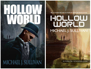
For Hollow World, another project of mine, I’m the publisher, so I did do a lot of testing. I started out by approaching Marc Simonetti (who has done the French covers of my Riyria books, as well as the French covers for Patrick Rothfuss’s King Killers and the Spanish version of George R.R. Martin’s Game of Thrones, just to name a few) to depict Hollow World itself. He did an AMAZING job. So much so that I’ve had posters and bookmarks made as part of the Kickstarter for that project. As I started creating and testing the cover, however, I realized I had a problem. No matter what I did, the book came out looking too much like a fantasy novel. This isn’t really a bad thing. In many ways Hollow World is a fantasy, the classic hero’s tale of an ordinary man on an extraordinary adventure. But it is also a science fiction novel involving time travel, genetic engineering, and the effects of technology on society. After testing, it became apparent that I would have to downplay Marc’s exceptional artwork no matter how much I loved it in order to appeal to the thriller and science fiction markets.
This testing process demonstrated to me exactly why publishers avoid cross-genre works, because they do indeed present marketing challenges. But I see opportunities where others see obstacles, so I’m actually going to release the book two different ways. The contents will be exactly the same, but the cover, marketing copy, and categories selected will focus on different markets. Because of my extensive testing, there were several iterations of these two concepts before I reached my final versions, and the book will undoubtedly sell better because of my soliciting input before production. Here, then, are the covers I’ll be using for Hollow World.
It will be interesting to see what will happen with the covers of The First Empire. Part of me says, if the publisher decides to make their own, then we should present both sets and let the readers decide. At least then I’ll feel as though both options had the same shot at getting selected. But another part of me says that I’m still too much of a “small fry” to make such a demand and the likelihood of getting some form of contractual control over the cover is out of the question. If this is the case, then it comes down to how important decisions like control are. I can keep the covers I want and self-publish or relinquish full control and hope for the best.
Self-publishing is doing a lot to change the way traditional publishing is done these days, the most important of which is providing an alternate choice. I hope that they will learn from the self-publishing authors and think out of the box more (for instance having different versions targeted for different markets), as well as test cover options rather than repeating what has come before (do we really need more “blokes in cloaks”?). I think this is a case where “professionals” can learn from “the amateurs,” and by doing so, just might keep more of their authors from jumping the fence to the other side.
(Ed. Note: This Sunday, July 7th, Amazing Stories publishes an excerpt from Michael J. Sullivan’s novel The Crown Tower)
Michael J. Sullivan is a speculative fiction writer who has written twenty-five novels and released nine. Eight of his fantasy books (The Riyria Revelations, and The Riyria Chronicles), were published by Hachette Book Group’s Orbit imprint. Hollow World, a science-fiction thriller was released by Tachyon Publications. The first four books of his new series, The First Empire, has sold to Random House’s Del Rey imprint, and the first book is scheduled to be released in the summer of 2016. He can be found on twitter, through his blog www.riyria.com, and on his facebook page and his publisher’s page for the series.


Thanks J.
I’m glad you are finding the posts helpful. And 12 books!! I thought I was crazy for doing 6. But I’m glad to hear they are in trilogies.
Another good read, Micheal.
I’ve been chipping away on a 12 book series (4 trilogies) and the first thing I did was to design covers. It was just my way of wrapping my head around the project. I’m a visual person and it was motivating to do that. I’m a little dissappointed to hear that traditional publishers don’t listen much to the author about the covers.
But I suppose you’re right about the utility of pitching a book. You need something. People are just that way. The cover is a clue to what’s inside.
One thing I’ve always wanted on my covers was good information. (Another reason I read your blogs.) When the cover distorts your characters, you can’t help but flinch. Self-publishing has a lot of risk, but there’s a lot of control that I like more and more.