In order to understand what makes really good science fiction and fantasy art, you have to look at a few pieces of bad science fiction and fantasy art. In order to know what will work sometimes it helps to look at something that really doesn’t.
Now, I know, good and bad are subjective terms. What one viewer likes might just repulse another. Taste is subjective. Having said that, there are some pieces of art that most viewers would consider to be… not up to snuff.
And I don’t want to use the word ‘bad’ as a pejorative, either. I’m certainly not trying to denigrate any one artist’s work (nor the artist himself! See last week’s blog column for my thoughts on that). Nor am I going to point and laugh at artists whose work is not yet at what most would consider ‘professional standards’. What I’m going to look at are examples of work produced by professional artists that have ended up on the covers of actual science fiction or fantasy books or other publications.
So, this will be more along the lines of: “What were they thinking?”
So, here we go with some examples:

I’m going to start with an early example from the old pulps. Now, there are a lot of examples of bad art that were printed on the old pulp covers, but people usually expect that. In fact, most times people are surprised at examples of really good art that comes from the old pulps. This one from 1934 is one of the first Weird Tales covers to illustrates a story by Robert E. Howard — a Conan story, no less! The artist is Margaret Brundage, who usually produced much more interesting images than this. This cover, however, plays to all her weaknesses as an artist. Despite depicting Conan wrapped in a huge snake and wielding a scimitar, there is little sense of danger in this picture. The scantily clad woman looking on in a desultory fashion does little to heighten the sense of excitement.
I’m being a little unfair here because this scene has been depicted so many times over the years by other artists (Frank Frazetta, Michael Kaluta and John Howe, to name a few) and all have been able to give it a much greater feel of excitement and danger than Brundage was able to.

The second example is a book cover from a 1975 British edition of Piers Anthony’s Sos the Rope. The artist has chosen to render the image in a somewhat cartoonish style, but, honestly, the whole thing is a bit of a mess. There is no focus to the composition. I suppose it’s meant to be the figure’s face with its queer expression and lopsided hair, but so many other elements fight for the eye’s attention and each is just about as badly rendered. This image gives absolutely no sense of what the book is about other than a muscled, hairy man holding a rope.
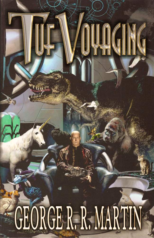
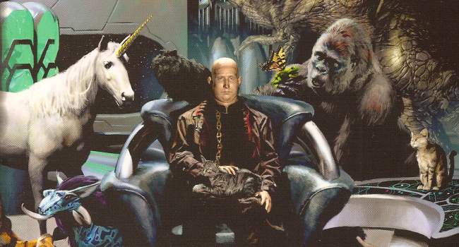
Here’s a cover of more recent vintage. This is a 2003 cover for a collection of George R. R. Martin’s Haviland Tuf stories. Obviously this was pre-Game of Thrones, because this cover is a mess. I’m not certain but it looks like the figures have been rendered by computer. Although supposedly about a spaceship teeming with life, none of the figures looks particularly lifelike. The bald man sitting stiffly in his chair is mean to be the focus of the composition but he is so uninteresting and his expression so bland that the animals surrounding him quickly take over. But there is just too much in this image!

Here are two covers for Fritz Leiber’s The Green Millenium. That particular book does not seem to have had much luck with cover art. The first is from the 1954 edition where the artists tried something different and angular but ended up with a bit of a mess.

The second cover is from a 1976 Orbit edition where the artist chose to simplify the image but… I know the book is called The Green Millennium but couldn’t the artist at least have varied the green tones? And I don’t know if it is a tiny woman riding a normal sized kitten or a normal sized woman riding a giant kitten. Either way the kitten does not look capable of sustaining its rider’s weight. She looks like she is about to fall off despite how she is able to (awkwardly) wrap her legs around the kitty’s neck.
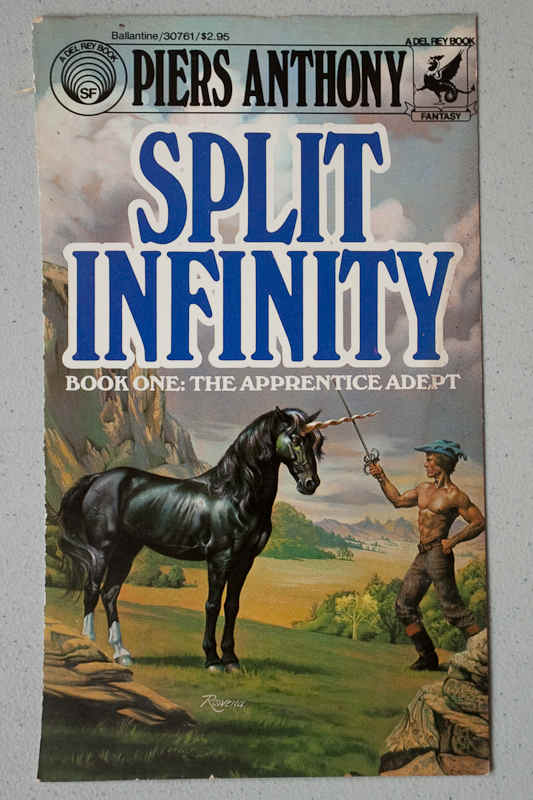
Here is one from a 1980 edition of Split Infinity by an artist that I admire greatly. Normally this artist can produce images that can stand up with the best fantasy and science fiction art. This time, however, not so much. The elements are rendered beautifully and there is at least a sense of life in the figures, but the composition is so flat and uninteresting. There is no sense of danger or excitement. The man’s pose is silly, like something from a Monty Python sketch. His blue hat does not help much. I can only assume the artist was saddled with an unimaginative art director for this assignment.

Here is another British edition of The Wanderer by Fritz Leiber. Again, here Leiber seems not to have much luck with cover artists and this one seems to have somewhat less than an affinity for depictiong cats. Or people.
Here are a few other examples of bad science fiction or fantasy art. I will let the images speak for themselves. The less said about them the better, I think
And just to show that I’m not above making my own bad fantasy art here is a cover I did a while back for C.J. Burch’s book Foolish Gods. I cringe every time I see it and, despite having produced a better cover for the book since, this old one still seems to crop up everywhere.

Now, I have to say that finding bad art was more difficult than I thought it was going to be. A lot of what the internet considers to be bad science fiction or fantasy art is actually good art – that is, well constructed images using competent draftsmanship and acceptable composition – but containing overused tropes. I don’t consider that to be bad art. Bad, or more likely, lazy marketing, maybe, but the art is decent.
Or maybe I’m just more forgiving when it comes to artwork.
Any other artwork you want to nominate as some of the worst? Let me know, either via the comment box or by email. If I get enough interesting nominations I will certainly revisit this topic at a future date.
M. D. Jackson has been drawing since he could first hold a pencil. He has been writing for so long that he has, in fact, developed an alternate personality named Jack to handle the fiction.
His work has appeared in numerous magazines and on the front covers of many books as well as in the pages of Amazing Stories Magazine. You can also see a lot of it at his gallery.