Let’s talk about Stranger Things. After all, it seems that everybody else is talking about the Netflix original series, the one that is suddenly getting more people watching it then previous Netflix hits like Daredevil and Jessica Jones. One of the coolest things about this 8-part science fiction/horror/dark fantasy miniseries is the amazing retro-feel that it has as it harkens back to all your favorite movies from the 1980s. That gives me the opportunity to talk about visual design.
 What the creators of Stranger Things, the Duffer Brothers, have done is given their series a very distinct look. The atmosphere of the show is steeped in the same atmosphere that we found in films like E.T.: The Extraterrestrial, The Goonies, Poltergeist, Explorers and countless other great (and some not so great) science fiction films from the 1980s, films that we all saw and loved. It’s meant to be an homage to those halcyon days of pre-internet cinema going. A few have called it a deliberate rip-off, but that’s not the case at all. The look of Stranger Things is the result of a deliberate design decision.
As a designer every once in a while I am asked to create something, usually a book cover, that looks or feels like an old-style paperback or an old pulp magazine. Many of my clients are writing e-books meant to be downloaded to kindle, or, if there is a print component, it is usually a POD (Print on Demand) edition which, as reading experiences go, is about as 21st century as it gets.
Many of my clients are writing books that were inspired by the books they read as kids. In their day they didn’t have Kindles or Kobos or even the internet. Their fiction was delivered to them via dog-eared paperback books from Bantam or Ace. A lot of my clients write in the style of the older pulp magazines from the 1930s and the 1940s. They want the covers that I design for their books to look as much like those older forms as possible.
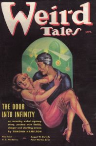 The most extreme example of this happened when I was art director for Dark Worlds Magazine. The editor and publisher of Dark Worlds, G. W. Thomas, wrote a story, The Case of the Phantom Legion, which was inspired by old pulp tales like those found in the pages of Weird Tales Magazine. The story was told in the form of one long story along with two follow-up short stories. Thomas asked me to design a print edition that would appear like an old pulp magazine, something like an old edition of Weird Tales.
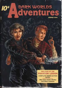 The challenge for me was to get as close as possible to the look and feel of an old pulp magazine within the confines of modern day POD limitations. The result was Dark World Adventures #1, the first and only edition of a fantasy, horror monthly that told within its pages the story that Thomas wanted to tell in a form as close as possible to an old pulp magazine.
I think I succeeded. Apparently a dealer at a pulp fiction convention had a copy and attendees kept asking about it as if it actually were an old pulp magazine. Mission accomplished.
That’s exactly what the Duffer Brothers have done with Stranger Things. There is little that is more 21st century than the Netflix experience. In the pre-internet 1980s, television was either broadcast or cable and movies were either experienced at the cinemas or watched on VHS videotape. The idea of a streaming, on-demand service for movies and television was complete science fiction back then.
It is more then a little ironic, then, that such a huge hit for Netflix should be one that reminds us of the days before Netflix existed.
M. D. Jackson has been drawing since he could first hold a pencil. He has been writing for so long that he has, in fact, developed an alternate personality named Jack to handle the fiction.
His work has appeared in numerous magazines and on the front covers of many books as well as in the pages of Amazing Stories Magazine. You can also see a lot of it at his gallery.






I get what you’re saying, MD, but I couldn’t get past the first half hour for all the reasons you cite as positive. All I saw where cliches.