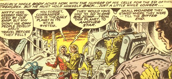
What’s not to like in the above illustration? You got your alien monster, your alien ruins, your sophisticated space science gizmos, your overall 1950s retro look and art style. Perfect. Exactly what I want in SF comic art, or “graphic art” as they say nowadays.
Except, except… one irritating detail.
Look at the helmeted guy on the right punching buttons. Look at his hand. Look at his fingernails. That’s one tight-fitting glove! Green gloves one layer of molecules thick apparently. Not an accident, several other scenes depict equally thin gloving with fingernails clearly visible. Futuristic clothing technology?
Or did the artist assume, the alien planet possessing an atmosphere, albeit a non-breathable one, that the human explorers needed only their regular tight-fitting uniforms (they wear the same outfits inside their spaceship basecamp) with the addition of glass helmets and oxygen backpacks, their hands drawn ungloved? And later the colourist decided it didn’t look right and painted the naked hands the colour appropriate to the colour of the uniform worn?
And what’s with the machine the guy is playing with? Looks kind of bulky for an explorer to be carting around on an unknown world. Or is it an alien machine found in the ruins and he can’t resist punching the buttons to see if it is still working and what it does? A bit risky that.
My attention to detail can be a bit nit-picky at times and is best not disturbed lest it pull me out of what I am reading and bring the narrative to a crashing halt. Sad to say this frequently happened with this particular comics series, so much so that I had to force myself to buy it.
Weird eh? Why would I force myself to buy comic books if I didn’t like them? The concept.
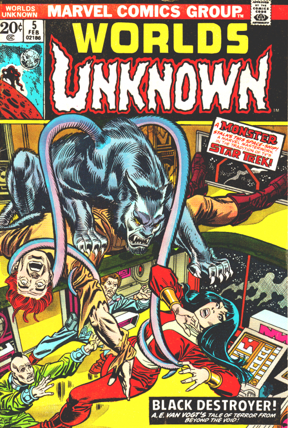
The illustration at the beginning of this article is from a Marvel Comics Group adaptation of A.E. Van Vogt’s famous 1939 short story BLACK DESTROYER which appeared in their short-lived eight issue run of WORLDS UNKNOWN comic books between May of 1973 to August of 1974 (I own issues 2 to 6).
Each issue featured a classic science fiction tale by a well-known author, plus a second story by another known author, or an unaccredited short story, or no additional tale at all (almost as if they were experimenting with the format of the comic in an effort to get it right).
Still, I gotta hand it to them. A magnificent concept. Some of my favourite short stories being presented in illustrations, next best thing to a TV or film version as far as I was concerned. So naturally I was on the lookout for them whenever I visited The Comic Shop on Fourth Avenue in Vancouver.
Again, what’s not to like? Consider the illustration below.

It has a marvelous cinematic feel to it, what with a point of view from just behind Coeurl’s head. The series as a whole is laid out like storyboards for films. That aspect of WORLDS UNKNOWN is quite well done. Marvel noted for this, and maybe that’s why it is so easy to convert their comics into movies? Nah. But it does make for a great sense of movement in the illustrations, not at all static like, say, most of the CLASSICS ILUSTRATED comics. Much better adaptation of the written form.
A little bit talky mayhaps, given the urgency of what is being portrayed, but one of the conventions of graphic art, and very necessary in an adaptation, so much info to convey in so few illustrations.
Nope. Overall, I liked the BLACK DESTROYER edition. Well done I thought.
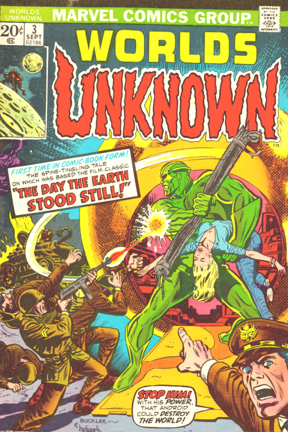
On the other hand, my next sample, THE DAY THE EARTH STOOD STILL edition, still makes me grit my teeth every time I look at it. The cover for instance. No such scene in the movie as I recall. Of course, not fair to compare the comic with the film, since the comic (and the film) is based on the 1940 short story FAREWELL TO THE MASTER by Harry Bates (real name Hiram Gilmore Bates III).
How Can I hate the cover? Is not the “First Time in Comic Book Form” a marvel to behold? Certainly writer/editor Roy Thomas loved both the movie and the original short story, writing of the film: “Michael Rennie intrigued. Patricia Neal fascinated. The Flying Saucer stunned. And Gort, the giant robot from another star—well, he was Gort. What else can I say?”
And of his quest for the rights: “So, imagine my shock when I discovered, upon snooping around, that author Harry Bates—the same Harry Bates who had been creator and first editor of ASTOUNDING, one of the finest s-f pulps of all time, back in the early 1930s—was alive and well and lining in good ol’ Gotham itself! Not only that, but he was genial and loquacious—and quite happy to see his much-praised but seldom re-printed tale adapted into comics form, especially insofar as I had made clear my attention to be much more faithful to the original than had the moguls of movieland.”
So why do I hate the cover? Look at the portrayal of Gort, the robot. Actually, and here the comic is faithful to the story, Gnut the robot. Is this YOUR idea of a robot? Not MY idea of a robot. A Marvel super villain perhaps. But not what the story describes or the movie depicts.
And there’s Klaatu. Take a gander at the illustration below.
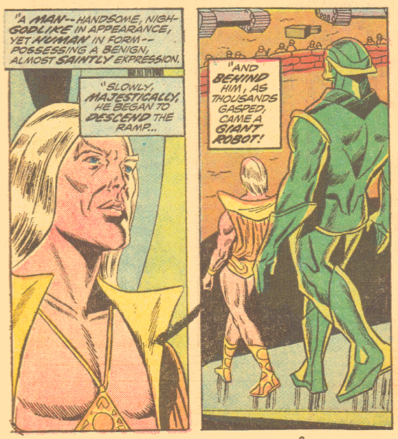
Michael Rennie he ain’t.
“…nigh-Godlike in appearance”? Hardly. “…a benign, almost saintly expession.”? Stunned I’d say.
“Slowly, majestically, he began to descend the ramp.” In those boots? In that skimpy golden outfit? More like a model descending the ramp at a gay nightclub.
Is this the 1970s vision of what an awesome Alien of superior beauty, intellect and culture looks like? Is this what the boys reading this wanted to be like when they got older? A sort of ultimate hippie, well-groomed and gleaming? Well, given the era, mid-seventies, maybe this is what girls dreamed of dating. Which explains my sporadic dating experience I suppose. Ghu knows I didn’t resemble Klaatu. Rather glad of that actually.
At any rate, I was disappointed. I expected Klaatu to be human yet oddly so, like Rennie with his thin body and high cheekbones, not some simpering narcissist from outer space. It just seemed wrong somehow. I resented the way the character was portrayed.
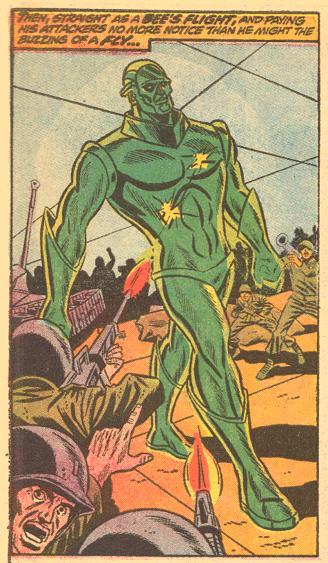
Gnut, at least, is menacing and threatening looking. In most scenes his eyes glow red. We all know evil robots have glowing red eyes. So that checks out okay.
But what’s with the metal thong bikini bottom? How menacing is that? Well, I suppose, under certain circumstances… we don’t get to see what Gnut does in his off-duty hours. Probably just as well.
Perhaps, given his biggest, baddest guy on the block walking scene reproduced here, this is what he looks like when he’s off to have a good time. But with those boots, the gloves, the bikini bottom and the Ghu-knows-what around his neck, just a tad too precious to be truly threatening.
But then, I have to remember I collected science fiction, horror, and war comic books. I was never into the super hero comics at all, except occasionally glancing through a Batman or Submariner comic owned by friends. Never bought any of my own.
Consequently I never bought into the “reality” of the Marvel Comics universe. Never grew accustomed to skin-tight uniforms as visible shorthand for superhuman health and physical prowess (at least I think that’s what this sort of outfit represents). To me it has always remained a fundamentally silly concept, something I have to ignore in order to appreciate the characters.
Nevertheless, the appearance of Klaatu and Gnut ruined that particular WORLDS UNKNOWN issue for me. Found it very hard to take this version of the tale seriously. I can’t help but wonder what Bates thought of it when it was published. I hate to think how disappointed he might have been. On the other hand, being an experienced author and editor, maybe he thought Marvel did a splendid job of tailoring the look of it to appeal to contemporary audiences. If so, it has dated rather badly.

A much better job of adaptation is the issue based on Fredric Brown’s 1944 short story ARENA. The alien combatant, as you can see from the cover, is decidedly creepy. In fact, the scenes where the alien is running toward the hero weird me out considerably.
And as for the hero, no silly outfit, he is merely reduced to his underwear to emphasis the helpless, natural state the omnipotent alien mastermind left both “victims” when it dropped them into the arena. Not quite fair of course, the red creepy being equipped with bigger teeth and claw-tipped tentacles. However, this makes it a credible threat. One automatically roots for the hero.
Again, a very cinematic approach renders the action quite exciting and believable. Marvel does this very well. But, at least in this series, Marvel also does its level best to pop you out of the action because every time you turn a page of the story you are confronted with one or two pages of adverts before the story resumes. Rarely you get four, even five pages of continuous scenes, but usually just two or three. I found this mightily distracting.
Another thing I found annoying were subliminally tiny lines of advertising at the bottom of pages of artwork in THE THING CALLED KILLDOZER issue (based on Theodore sturgeon’s 1944 short story KILLDOZER), such as:
“Morbius, the Living Vampire – in the clutches of the Caretaker – Now!”
“Nothing can withstand the howl of the Banshee – not even Captain America!”
“Thor and Hercules – before the gates of Hell! Don’t miss this landmark issue!”
I don’t know if this is common practice in comic books, but it was another turnoff.

Was I alone in my general dislike for the series despite its exciting promise? It only lasted eight issues. Perhaps the majority of readers shared my lack of appreciation for the Marvel style?
Yet Marvel tried again in 1975 with a black & white illustrated magazine titled UNKNOWN WORLDS OF SCIENCE FICTION featuring illustrated versions of stories by popular writers such as Harlan Ellison, Otis Adelbert Kline, and Stanley Weinbaum. It only lasted 6 issues.
Why? It can’t be Marvel’s signature style. It has always been popular with comic book fans. Marvel comics remain one of the most popular comics companies in existence. Marvel fans would not find fault with Marvel being Marvel.
I suspect that, back in the seventies, and even now, perhaps the majority of Marvel Comics fans were (and are) not particularly well-read fans of classic science fiction short stories. The appearance of the illustrated stories may have fit comfortably into the Marvel “reality,” but the “feel” of them, the very nature of them, may have seemed uncomfortably different.
In a sense, this bold experiment represented a kind of cross-genre effort doomed from the start. Or maybe I am overthinking the problem. As I understand it most if not all Marvel comics feature ongoing characters whom readers get to know and follow along in their careers. The WORLDS UNKNOWN featured short stories complete in themselves and may simply have not appealed to the Marvel readership, not what they were used to.
I personally would like to see hundreds of old-time SF stories converted into graphic art books, perhaps ideally in a style reminiscent of Wally Wood. But I haven’t the faintest idea if anyone else dreams the same dream. Probably not marketable. Sigh.






Recent Comments