My third interview at New York Comic-Con was with the book designer Colleen AF Venable, who has been designing the books published by First Second. Over her 4 year tenure, she has designed many award-winning graphic novels (some awarded for their design) and writes a children’s comic series. I sat down with her to discuss her approach to design, her thoughts on the industry, and was fortunate enough to be given a tour by her of the First Second offices in the iconic Flatiron Building in New York City.

Zachary Clemente for Amazing Stories: What are your parameters for a well-designed book?
Colleen AF Venable: I was actually thinking about this today, because I was talking to some people and they were calling themselves “design-snobs” and I was like “I’m not a ‘design-snob’ – I’m a story-telling snob.” […] There’s a big difference between good design and a good design for a particular book. I think the book needs to feel like it’s one with the cover. So, for me, I have a couple of rules: one, it really needs to be striking – it needs to look good in thumbnail form, it needs to look good spine-out – and the artist has to not hate it. I never want a book go to press where an artist hates their book.
ASM: On average, how much do you know about the book when you’re designing the cover – do you have the full thing?
CAFV: I do, I read the books twice, at least twice. The first time I read it […] just to enjoy, kind of absorb it. The second time I read it trying to think about the cover the whole time I read it. So, I’m kind of really against designing anything if you haven’t read the book and I don’t understand designers that can do that, and I do occasional YA novels for our sister imprint, and it’s the same thing: I need to read the script and I need to read it twice – because the first time, if it’s a good book, you’re just going to be absorbed in it. Afterwards, you can kind of step back and go “okay, now what is the best way to represent this book in a really visually beautiful way?”
ASM: [What is] an example of one you’ve done recently that was a lot of fun for you in that respect?
CAFV: Boxers & Saints [by Gene Yang] because it started off, when we first bought it, […] as one volume and it was huge. I think it would have been about 700 pages if we’d done it as one volume. […] It’s two [parallel] stories – it’s the Boxer Rebellion told from both sides, the Chinese who were fighting as the Christians were coming in one book, Boxers and the second one, Saints about a Chinese girl who converts to Christianity. I wanted it to be so they went along with each other, but the stories were told so differently, even in terms of color palette, executed entirely by Lark Pien, so one of the books is full-color, super bright, beautiful: Boxers.
Saints is almost entirely black and white, with occasional spots of yellow, […] when certain characters show up, they glow yellow. It was just a really interesting challenge to have these two covers. I was asking how do I make it so if that someone ever sees just Boxers, and then they see Saints like a month later they go “oh wait, that’s connected to that other book” but also make it true to the stories. So, it was actually kind of great because Gene is very much hands off of covers and he actually likes me to sketch up the covers for him, so there’s this horrible sketch that exists that’s just two squares and two half-circles and it just says “face”, “face”, “bright color”, “dark color”!
ASM: I own the boxed set and I love it. It’s just beautiful, one of those ones I’m very proud to have on my shelf.
CAFV: Oh yeah, […] I also have to have MacMillan sales department so much credit because they let me do a boxed set cover with no type on it. Normally when they do boxed sets, they’re like “New York Times Best Seller! National Book Award Finalist!”, they just want to put everything on it because they’re trying to sell the book, but with this they said “the art is so beautiful, that sells the book more than anything we’re going to write on top of it is going to […].” It was a really great project.
ASM: Have you ever designed books that aren’t graphic novels or aren’t for First Second?
CAFV: I have – I really like YA and middle-grade and our sister imprint […] I actually have “thing” with MacMillan where they let me trade one interior of one of our First Second books, because I actually am the entire department so I usually do the interiors and the covers, […] in order to do a YA cover that they normally would have freelanced out. It’s great too because I kind of get to choose from the list and I did one recently that was called Freakboy which was a really interesting challenge because it was about a boy in high school who starts to realize he’s actually a woman inside, but he’s straight as well. It’s all about being trans and coming out, and it’s all about his girlfriend and whether or not she stays with him. It’s told in three voices and I wanted it to have a great cover that was not going to turn off the readers who really need to find this book. When I was talking initially with the company, they were saying “well, he wears this green bra, you should have a green bra on the cover” and I was saying “no guy that’s questioning his sexuality is going to walk around with a green bra book.” We finally wound up doing this thing where there’s just a pile of broken glass and you almost see the “Men’s Room” sign, but it kind of goes with the glass. One side of him looks normal and the other side has these shards of glass just coming out – that was the whole cover and it went over really well.
ASM: That’s really lovely. I’m assuming that the relationship between First Second and MacMillan is good?
CAFV: Absolutely, yeah. We’re kind of the “weirdo” imprint [laughs], they treat us nicely, though. Because we do good books and it’s always interesting when I meet someone from a sister imprint that […] it’s almost like we gave them their first drug. It’s like “oh my god, I finally read a graphic novel and they’re so good, what other ones should I read?”
ASM: How do you incorporate what you consider interesting and successful design into your own personal life?
CAFV: [Laughs] My tattoo?
ASM: Yes, it’s one of the most interesting ones I’ve seen.
CAFV: My left leg’s internet famous, Wil Wheaton likes it, Mark Wahlberg hates it. Yeah, I have a giant connect-the-dots tattoo on one of my legs and liked the idea of a huge invisible tattoo – a very visible thing that people see. It kind of makes my day almost every day because a lot of times I’ll be on the train in the summer and someone will look at me, squinting, and you’ll see that little smile where they finally realize what it is. I’m very proud of that – and it’s an idea I had for like, five years – it was actually the end of an art project that I had done where I was searching for this giraffe stuffed animal I had as a child and I had 60 of my friends helping me all over the world – and when we finally found it, I wanted there to be something to commemorate this obsession with this…giraffe. […] We all have birthmarks that we haven’t chose and I got to choose these 64 birthmarks. Also 64 is a perfect square, my mom and sister are math teachers.
ASM: Like that of [Jonathan] Hickman, have you ever considered making comics as a writer and an artist, like he did with Transhuman and The Nightly News?
CAFV: My favorite thing about comics, for me, is collaboration – that’s what I feel like as a designer, when I work with the artist making the cover, that’s how I feel as a writer working with an artist drawing my words. There’s few things that make me happier than writing something that’s half-funny and then having someone else taking and just take it to that next step. I [actually] love being edited, I love working with my co-workers on designs – for me it’s all about a group. I guess I could do it all, but […] I think a lot of the joy would leave the project. Even with my own books, I don’t design the covers, someone else designs it – so I have no problem stepping back and being like “let’s work on this together.”
ASM: Are there certain tenants of contemporary comic design, like the book design, that you currently are really bothered by?
CAFV: There’s a couple things that make me twitch very badly – a lot of fonts, a lot of balloons that are done on computers that really don’t match up with beautiful, hand-drawn art. I actually feel bad for Comic Sans and Papyrus, because they’re not the worst fonts in the world, I’ve seen worse. I would love a hand-lettered book over fonts any day and nowadays it’s so easy to make fonts that […] have rotating characters so you wouldn’t wind up with the same “O” all the time – it’s nice to have that organic thing. Sometimes if you’re doing something that’s very straightforward “comic book,” yes, you’re going to want to use very traditional comic book fonts. But even then, I’m kind of like “everybody’s done that, try something new!”
The other thing that really bothers me – a lot of people don’t leave room in the gutters and I’m very big on an extra 1/8th of an inch in the gutters no matter what because I hate when I read a book, and there’s a beautiful piece of artwork that gets stuck right into that gutter. Bad gutters, bad fonts, bad balloons – I’m not too bad but I’ve definitely had some books where I couldn’t read because of the way they were done. There was a book recently that was printed on salmon paper and I just couldn’t read it! I just couldn’t! […] All the peoples’ faces were salmon and that’s just a horrible color.
ASM: On that note, do you have opinions on the paper that Vertigo prints on? They’re one of the few, very big publishers that uses a very different kind of paper – it’s more newspaper-y.
CAFV: I actually like that. I feel like when you’re using a super, super glossy stock, when you turn it – it just doesn’t feel nice on your fingertips. I feel if we’re going so far towards digital, the book needs to become more of an art object, and it needs to be not just a beautiful thing to look at, but a beautiful thing to hold, and a beautiful thing to read – which includes the actual page-turns and things like that. […] Personally, if I used it, I would be very worried about show-through with very dark art.
ASM: Funny, since that’s most of Vertigo’s work.
CAFV: Right! Like, I’d be worried if Mike Mignola wanted to do something on that stock. But, no – I actually really like what they’ve been doing.
ASM: I always found Vertigo’s trades to be too light because of the paper, I always wait for the hardcovers. So much about [object] design for me is in the heft – if it’s too light, there’s this cheapness about it.
CAFV: Going back to Boxers & Saints, that was something when we did the boxed set. A normal boxed set for something is usually very thin, kind of like cardboard and we basically had a whole line-up of ones that got heavier and heavier – and we just went directly to that heaviest one and went “we want this to be a brick, we want this to be the kind of thing you can’t hold with one hand comfortably” because you’re meant to take the books out and read it.
ASM: Inversely, are there any tenants of contemporary comic design that you love and enjoy?
CAFV: I was just geeking out at the Oni [Press] booth because they’re doing the color Scott Pilgrim books.
ASM: I’ve been collecting the Evil Editions, the third volume is my favorite.
CAFV: I was going to say the evil ones make me so happy! I always love the third one with the vegan [Todd Ingram]. What’s his name? I always say [drops voice] “The Vegan.” That one’s my favorites one too and that also has the whole Honest Ed’s fight scene – I’ve really liked what they’ve been planning with those. Rather than just keep doing what they’re doing, […] but revisiting every single time they re-do the book. I’ve been really excited by those.
I love a lot of things like D&Q [Drawn and Quarterly] has been doing, every time I see their books I always have this moment where I go “How?! How did they do this?! How do they get money to do this?!” because for us, the design has to really stand alone. Sometimes I’ll design something and I’ll go “okay, this has to be full foil and the entire cover design depends on this being full foil” and then at the very last minute, we’ll have to take the full foil away and suddenly the book doesn’t look right. So I learned over the years […] you can’t rely on those bells and whistles, but oh man, if I could have more of those bells and whistles, I’d be happy, happy person.
ASM: I feel the most successful covers for me have the minimal ones, like with Hickman’s The Manhattan Projects: it’s all colors, it’s all shapes.
CAFV: I’ve also been really loving the Hawkeye covers.
ASM: What did you think of issue #11?
CAFV: Which one was that again?
ASM: The pizza dog one?
CAFV: Oh! [Laughs] I’ve never actually read any Hawkeye, but I’ve been collecting the images of JPEGs on my desktop as covers I like, going “ooh, there’s another one!”
ASM: With the climate of comics becoming more aware of the blights being put on certain kinds of creators, especially artists, colorists, designers, letterers, inkers – those who often don’t get credited in the book or on the book. Have you noticed that your work has been more acknowledged or colleagues of yours that strictly don’t do work that is normally credited are getting more attention?
CAFV: With artists, it’s hard to say because we [First Second] don’t have many books that have separate colorists or have separate letterers, and when we do, we try to make sure that they get attention.
ASM: How about outside of First Second? A lot of artists have been saying that people forget to credit them or have them be crediting incorrectly. […] I remember spending hours looking for the colorist of a DC book – it’s really depressing that’s the case.
CAFV: Luckily, I don’t have to deal with that – I’d get in trouble by 12 rounds of copy-editors and proofreaders if I didn’t have the names of the people involved in the book, as it should be.
Also, I have to just go on my rant with the term “creator-owned” – I hate that term. I hate that term so much because why isn’t everything creator owned? That shouldn’t exist – it’s your baby, you have a right to it.
ASM: Again, that’s why I think Image and First Second are doing such a great job – they’re allowing for that option.
CAFV: There’s a lot that have been coming out of that and they’re doing really interesting things. Like Abrams has done some amazing books, Oni again, Top Shelf – it’s partially because the people feel very passionate about their won books – because they’re theirs, just the same way we think of them as ours, it’s really a family.
ASM: On that note, have you been reading Vaughan and Staples’ Saga?
CAFV: Yesss.
ASM: It’s interesting – at the panel last year they were talking about the very first dialogue and how it’s all about creation. One of the reasons I’m doing these interviews is because so many I’ve seen ask impossible questions to creators such as “where do your ideas come from?”
CAFV: [Donning a 20’s gangster accent] From a small man on 23rd street! He whispers to me and I give him five dollars! It’s where I get all my ideas. [Laughs] It’s always hard with that kind of stuff – because it is, you don’t know when ideas are going to come. I always keep a notebook on me, I go backwards and forwards through notebooks – I go on one side of the paper, then I go back on the other side of the paper because as I go back through the other side, I’ll come across things from maybe a year before that I had forgotten about – like a list of fonts I thought were great or just doodles for a cover. I also don’t feel like I’ve ever had a cover that I’ve 100% been in love with a year later, which I think is a really good thing. Every since cover I think “ah, I should have done ‘this'” or “I wish we had ‘this'” and I think as artist – that’s the way you keep improving, because if you start saying “I’m the best” you’ll notice a lot of people that claim they’re the best […], couple of years later, they’re not the best anymore.
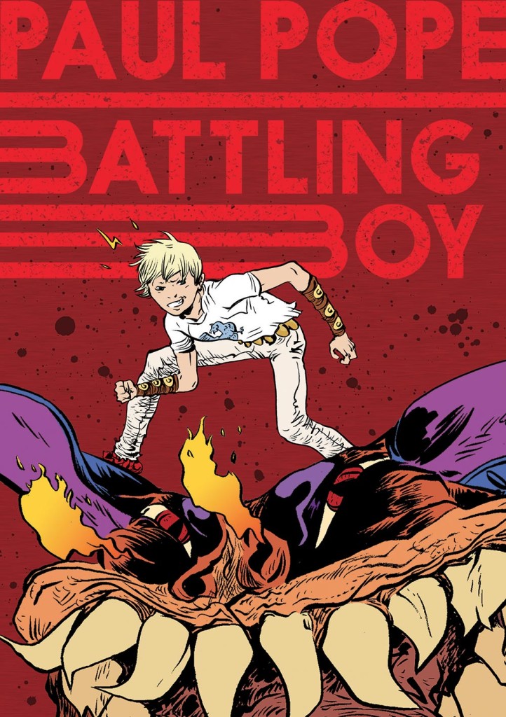
ASM: For the design of Battling Boy, how did the elongated, double-B come about?
CAFV: It was during the hurricane [Sandy], I was stuck in my apartment and there was no internet – they wanted me to do something that kind of like a Green Lantern logo that was a circle with something really iconic, with like, two B’s in there. I did I-don’t-know-how-many version of that – I did all these hand-drawn versions, I tried all these fonts – I had the B’s reversed, to it looked like a butterfly, then had the B’s going the same way. No matter what I did, it just all started to look like butts to me – there was something about the letter B that I just hated – I started to hate the letter B. […] I found a couple fonts that I was basing things off of that were very uniform, but then again, it didn’t look right and when you have two together, your eyes would just fall into the negative spaces and it just didn’t work. I think every designer’s had this, where you look at something for so long, it’s like saying one word over and over again – the word couch suddenly becomes nonsense.
So I started exploring a way to make something that was iconic but it was actually the straightforward words. Again – I wanted to get of that B, because I was sick of looking at it, so I had this idea of something that was kind of kinetic – I had ones that were kind of like lightning bolts coming through, turning into the B – but really, it works so well, just having it be straight across, kind of swooshing into the letters. It’s worked really great on everything we’ve used it for, which I feel is a sign of a good logo. It’s not like the Batman logo, but in some ways I feel I like that it’s a newer thing because he’s a new superhero and he doesn’t wear the same outfit all the time, he doesn’t have the same stupid logo on his chest all the time – it feels more organic with who he is as a character in the book.
ASM: That design made me enjoy the motion trailer – it’s the only motion trailer I’ve enjoyed, usually I really dislike them because I feel that it’s failing the medium.
CAFV: [Laughing] That’s great! I have some issues with book trailers as well, because, well, it’s a book!
ASM: I saw the first interior page that they put on Boing Boing of [The Rise of] Aurora West offshoot, I’m very excited.
CAFV: That was also another fun cover to do – it’s actually her facing off against a monster, which you can’t quite tell but she’s got this great expression on her face where she’s kind of badass but also a little scared – even her stance. I love the weapons that Paul [Pope] designed for her, she kind of got these sticks that have electricity.
ASM: It looks like the “kinetic B” sort of got turned into the property font.
CAFV: Yeah the font and logo. Series are hard sometimes because you have this idea and it worked great with the B’s and then I was trying to do the same thing with the words “Aurora West” and swooshes with A’s – it just became not a letter. Swooshes with W’s – that was just weird. […] I tried redrawing a lot of W’s and finally I ended up going very straightforward, but very, very big. So, it’s a small “Aurora”, a tiny, almost whispering “The Rise Of” and “West” is just monstrous.
ASM: Which I think is really appropriate since she’s riding the coattails of her father.
CAFV: Exactly, it’s basically about her coming on her own – about living under the name “West”, which she does on the cover.
ASM: What I’m really excited about is finding out more about Ms. Gratley.
CAFV: I know!
ASM: She has such buff arms!
CAFV: I know! And her robot leg!
ASM: Are there any books out there that you’re currently really loving the design of?
CAFV: The Rube Goldberg book – by Abrams. It’s very long and horizontal and it’s all of Rube Goldberg’s machines across the pages and it’s got a lot of information about his life but it’s just beautifully designed. It actually has a machine in the cover, a clear little thing, you can around and make it go along – I’m a sucker for things like that. Again, the [design of] Saga, her covers… Every time we have a meeting where we go “let’s put on our caps and dream about who we might want to work with,” I’m going “Fiona Staples!” There’s no question about it – they ask “who else?” “Fiona Staples! When is this going to happen?” I think her design is gorgeous, there’s a huge difference between a stunning illustration and a stunning cover – she is great at bringing those together. There’s a lot of times where I see a piece of artwork and I go “oh, this is beautiful” and by the time it becomes a book and you see if far away in a book store or you see it as a tiny, tiny thumbnail on a website – you […] figure out what works and what doesn’t.
ASM: Another book I think that succeeds in that is Wonder Woman with Cliff Chiang’s covers.
CAFV: Oh yeah, I love the cover to the second one [Guts] with the design for Hephaestus.
ASM: With the volcanic arms? Definitely.
CAFV: I’m working on the Olympians books with George O’Connor – and since I’m actually reading Wonder Woman now, I know so much more, it’s amazing! I really care about these small characters that I never cared about before – like Hephaestus.
ASM: The question I’ve been asking just about everybody – because everybody who is working in this [comics] industry has a stake – there’s been a lot of critical attention on the mainstream comics companies, do you have any words of wisdom for creators, editors, decision-makers to make this a better climate for creators and readers alike?
CAVF: Focus on the books, focus on the stories – I feel a lot of it is coming down to wanting to make things that are “saleable,” […] a word that I hate, but hear all the time.
ASM: “Sellable” or “saleable”?
CAFV: I always say “saleable,” it’s probably just “sellable” – think it’s the same thing.
ASM: If kind of sounds like the “synergy,” which shouldn’t exist but does?
CAFV: Yeah, it’s a sales word and the only people that use it seriously are sales people. I feel a lot of times they’re looking at numbers and they’re trying to figure out a formula and I think the people who have all broken out are the people who have gone against the formula. All the comics in the last ten years that have really exploded: Scott Pilgrim, Saga. They do not fit in that formula and that’s why people trying to re-do the things that happened before, no names mentioned, they’re flailing because people want […] what’s in their brain. I think it’s really about finding the “new” and I think that’s what’s going to save this industry.
The thing that’s always true is that if you are good, and have good work, and work hard – people will find it and people want to pay for it. It’s true if you look at a lot of the webcomics that have exploded, it’s because they work really hard and make really good work.
ASM: One of the thing that makes me really happy is Pen Ward’s overarching allowance with Boom! Comics.
CAFV: Oh my gosh, it’s amazing! There’s also a lot of cartoonists who have been working on Axe Cop. The whole web series is just amazing.
ASM: It’s written by two brothers.
CAFV: Yeah! One of them was like…five when they started, now he’s a little older. […] I always say the best thing you can ever do with your career is don’t be a jerk and if you make friends – your friends will go onto to do things, you’ll go onto to do things and you’ll want to bring the people you enjoy with you.
ASM: That’s really stuck with me since the panel at MICE and it’s constantly confirmed. Everybody has been saying if you’re talented but not very nice, they will find someone who is more talented and nicer to work with than you.
CAFV: That’s kind of become my motto.
ASM: I’ve been really enjoying this convention, I’ve seen so many First Second books and really loving their designs, especially the spines.
CAFV: Yeah, that’s always one of the hardest parts. I always say there are three covers for every book: you’ve got the front cover, the spine, and the back cover. I’ve gotten more and more away from wrap-around covers unless the back cover is just as interesting as the front cover – because you have another chance to have a cover!
ASM: So you moved from MacMillan to First Second about two or three years ago?
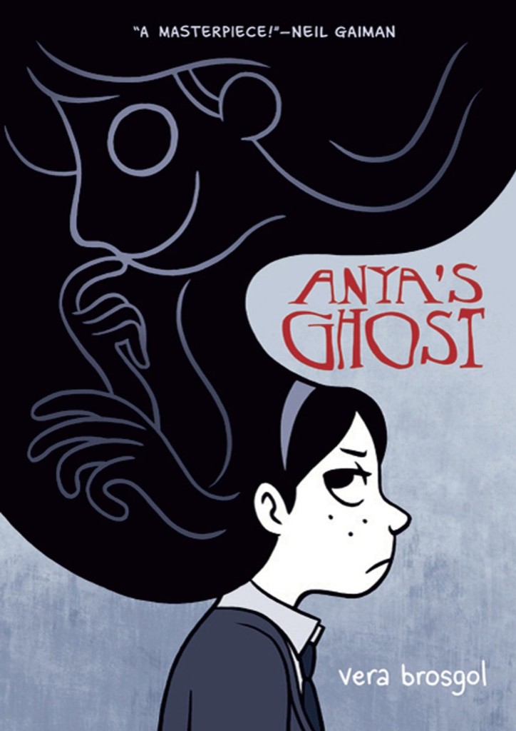
CAFV: About four years ago. I was previously in marketing – a very odd transition, this is not a normal way to do a career. First Second and MacMillan actually liked my ideas – I didn’t even try to be the designer, I just had a loud mouth in cover meetings. They sent me back to school at night and I had never used InDesign in my life and now I have designed 70 books – it’s kind of crazy. Last year I actually got two book industry awards for design for Anya’s Ghost cover design and the entire package design with Derek Kirk Kim and Alexa Villanueva for Same Difference. It’s so nice to be recognized as the people who aren’t the writers and care about paper stock and care about the actual production of the book. We got the third place for Same Difference because of the end paper color- which was kind of a little fight with me because I wanted this neon orange and they were like “oh gosh, no.” We finally wound up doing it and after you read the book and turn the page, it’s just the glow that kind of just warms your heart.
ASM: Last thing, I’m interested in the way in which people present themselves – how they control their public persona. I’m curious why you include the “AF” in your name?
CAFV: Oh! That’s a long story, but I can give you the short version which is I have a cousin named Colleen – she was born a month after me, she is a graphic designer. Growing up, we were always Colleen Lynn and Colleen Ann – and I hated the name Colleen Ann. It always felt like you going to say something else. “Colleen and…what?” So when I turned 14 I asked my parents for another name and of course when you’re 14, you choose names like “Felicity,” so I was Colleen Ann Felicity Venable for a while. I finally decided to shorten it down to “AF” and during the period I did this, I was very bad at typing, so I was bad at hitting the period key. I just started to go with the “AF” with no periods between it – I also thought visually, it made it look so interesting and it became one of those names where you see it once on paper, you don’t forget it. […] I think of myself more as a “Colleen AF” than I do as a “Colleen” now.
ASM: I find that very thoughtful – not many think this kind of thing through, so thank you.
CAFV: Thank you!
Colleen AF Venable works for First Second Books in the iconic Flatiron Building in New York City designing their books for print. Notable designs include: Battling Boy, Boxers & Saints, Anya’s Ghost, and Primates. She also writes the children’s comic series Guinea Pig: Pet Shop Private Eye.






Recent Comments