The old axiom about not judging a book by its cover notwithstanding, I am going to judge the merits of various book covers that wrapped editions of heroic fiction. This is not a scholarly article, nor do I pretend that it is complete, lest someone accuse me of being reductionist. I just want to take a brief survey of the history and trends that have shown up on the covers of heroic fantasy books.
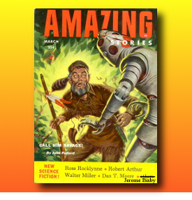
Much of what is classified as heroic fantasy, specifically, sword and sorcery, was born in the pulp magazines from the early 20th century. The covers of these magazines were often lurid and, in some cases, somewhat clumsily executed. One of the standout artists of this genre, however, was J. Allen St. John. St. John was notable for painting lush and colorful covers for the earliest appearances of the fiction of Edgar Rice Burroughs.
 Another notable artist of the time was Margaret Brundage. Brundage was unusual, not just because she was a woman working in a male dominated industry, but because her artwork, mostly done in pastels, had a beautiful sense of color, Her work seems to glow from the front covers. Given the early state of print technology that is a fair achievement.
Brundage is also notable for being the first artist to depict the works of Robert E. Howard. In this day and age when every fantasy artist depicts images derived either directly or indirectly from Howard’s work, it is easy to forget that at one point he was just another Weird Tales writer and not even one of the magazine’s most popular ones. Howard’s stories rarely were depicted on the covers, but when they were it was Margaret Brundage who brought them to life.
Today we have a different expectation from fantasy artists so it is easy to miss the significance of these early Brundage paintings. They were designed to fit the needs of the magazine, nothing more. They were designed to titillate, to tease the hard-earned, depression-era dimes out of the pockets of readers. They must be forgiven If they do not overwhelm us as subsequent artists from the later decades have done.
After the death of the pulps came the rise of the paperback. Quick and dirty publications, the luridness of the pulp covers easily made the transition to smaller format. In these early days there was not a lot of examples of heroic fiction being published. When Weird Tales folded many writers were faced with the challenge of transitioning away from the genres that put money in their pockets. It seemed that the fledgling genre of heroic fantasy might have died out as well if not for Gnome Press.
Founded in 1948 by Martin Greenberg and David A Kyle, Gnome Press managed to bring Robert E. Howard’s writing back from the obscurity in which the death of the pulps had left it. These new Howard editions needed cover art, naturally, but the results lift a little to be desired. The cover images, although finely executed by Ed “Emsh” Emshwiller, did not have any of the luridness of the old Weird Tales art, nor much of a visceral impact that would be developed by later artists.
 Fast forward to the 1970’s. A struggling comic book artists had moved on to painting covers for science fiction and fantasy paperbacks. Frank Frazetta’s interpretation of Howard’s Conan visually redefined the genre and had an enormous impact on succeeding generations of artists. At this time there was an explosion of fantasy paperbacks and an explosion of fantastic cover art. Aside from Fran Frazetta, Howard and other heroic fantasy authors had editions with covers graced by artists such as Jeff Jones.
These mass market editions flooded the public consciousness, fixing forever in the minds of impressionable youths the “flavor” of heroic fantasy. When one thinks of Sword and Sorcery the first images that spring to mind are likely painted by Frank Frazetta. Frazetta’s work had a visceral impact. Many of his paintings seemed to roar to life in front of you, even when reproduced on a tiny paperback cover. Jeff Jones’ work matched that power but also had a lyrical beauty. Other artists like Ken Kelly and Michael Whelan burst on the scene and added to the symphony.
 This publishing trend continued into the early 1980’s, then slowly began to fade away. Books still had fantastic cover paintings, but they began to become contained. No longer did the image dominate the covers but were reprinted in smaller and smaller boxes which were dominated by type. New publishing technologies allowed raised lettering and gold foil inks and these elements soon began to dominate the books covers.
Before long cover art began to disappear altogether from fantasy book covers. This trend is not endemic to fantasy books, but is a spillover from mainstream books. Cover art is not the dominant concern of book publishers any more. Minimalism is the watchword and beautiful cover art seems to have been pushed into irrelevancy.
To be certain there still are many wonderful artists producing artwork for many fantasy editions. One only has to visit a bookstore and stand before the fantasy section to see that this is true. For my money, however, something of the wild excitement of cover art in the 1970’s has been lost in today’s market conscious world. With more emphasis on market research the packaging has become more generalized. The artist no longer roams free over the cover, he is only a contained part of a carefully constructed whole.
 Take for example a recent edition of George R. R. Martin’s GAME OF THRONES. Earlier editions sported cover art, but as the book crept further into bestseller territory, the cover art was reduced and eventually done away with almost completely. As fantasy books move their way into the public consciousness there is, it seems, a movement by publishers to neuter them of their power. The covers are watered down, excised of any elements that may offend delicate sensibilities or, indeed, any elements that smack of fantasy.
Before I am accused of being absolutist, I know that it isn’t all bad news. There are some wonderful books on the shelves that still sport traditional fantasy paintings. A recent sword and sorcery anthology, SWORDS AND DARK MAGIC sports a cover by Benjamin Carre (although only on the mass market edition. There is a limited edition of the anthology sporting a darker, more lurid and, in some ways, better cover). That seems to point up the problem in publishing. As editions become more widely distributed, the darkness, the wildness and in some cases the magic of the cover art becomes washed and diluted to suit the public taste.
Fortunately the internet has changed all that, as it seems to have done with everything. Fantasy art is on display everywhere online. It is almost as ubiquitous as porn and LOLcats. Computer technologies and programs like Photoshop and Painter have resulted in an explosion of fantasy art that shows up all over the web and very occasionally printed on the cover of a small press edition.
 Heroic fiction is no longer the sales leader that it was in the publishing industry, but much of the imagery associated with the genre has moved on and mutated into role-playing games and into movies and television. Indeed, for fans of the genre this is a great time to be alive. With the advent of CGI fantastic images assault us from all sides. The fantastic explosion of our imagination made real has moved from the covers of the pulp magazines and paperbacks onto our theater, television and computer screens. Even a recent commercial for Coca Cola was redolent with heroic fantasy images.
Myself, I am old school. Not exactly a luddite, but I still prefer paper over ipad, printing over pixels. I still hold onto early editions of heroic fantasy paperbacks and they are some of my most treasured possessions. One cannot match the feeling of sitting down with an early ace edition of Howard of other heroic fantasy author, admiring the cover art that should produce an excited anticipation of what awaits me within, then plunging in and being transported elsewhere and elsewhen.
I’ve only made the briefest of overviews of this subject. There is much much more to talk about. If you think I’ve missed some salient fact or you think I’m just plain wrong about something or you just think I talk funny, don’t keep it to yourself. Use the comment box. That’s what it’s for.
Go ahead. Give me a piece of your mind.
M. D. Jackson has been drawing since he could first hold a pencil. He has been writing for so long that he has, in fact, developed an alternate personality named Jack to handle the fiction.
His work has appeared in numerous magazines and on the front covers of many books as well as in the pages of Amazing Stories Magazine. You can also see a lot of it at his gallery.







Recent Comments