Early on in my series about why early comic book art was so crude (Part 1: Part 2)I mentioned two factors that drove comic book art up from the gutter and into the realms of fine art and public consciousness. The first factor I talked about last week was Will Eisner who helped to elevate comic book art from its early crudity into the realms of high art. The second factor was Stan Lee and the rise of Marvel Comics.
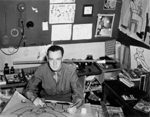 Stan Lee was born Stanley Martin Leiber in 1922. At 17 he became an assistant at the new Timely Comics division of pulp magazine publisher Martin Goodman’s company. This was one of those many companies that moved into comic books because the market was lucrative.
Lee’s duties were to keep inkpots filled and to get the artists their lunch. He did proofreading and he erased the pencil lines from the finished inked pages. But his ambition was to be a writer.
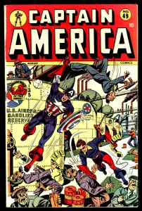
Eventually he got his chance and he adopted the pseudonym Stan Lee with a text filler he wrote for Captain America #3 in 1941. He introduced the character’s now iconic ricocheting shield toss.
Following a dispute with Martin Goodman, Timely’s editor, Joe Simon and his creative partner, Jack Kirby left the company. Goodman promoted the nineteen year old Lee to editor. Lee showed a knack for the business that led him to eventually become the company’s editor-in-chief as well as art director.
Timely eventually became Atlas Comics in the 1950’s and Lee wrote stories in a wide variety of genres including Westerns, Romance, Horror and Suspense titles. But in the late 1950’s Timely’s rival, DC Comics, revived the superhero comic, which had fallen out of favor, and experienced a significant success with its update of The Flash and the introduction of the Justice League of America. Goodman assigned Lee to create a new superhero team
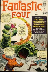 Lee was growing dissatisfied with his career at Atlas and felt he had nothing to lose. He created a team of superheroes who had flaws, who were complex and naturalistic, who had tempers, fits of melancholy and vanity and who occasionally bickered among themselves. Lee’s characters worried about prosaic things like paying bills and impressing girlfriends, who got bored and even sometimes caught a cold.
The first team that Lee and Jack Kirby (who had returned to Atlas) created was The Fantastic Four. He and Kirby would go on to create the Hulk, Thor, Iron Man and the X-men. With other artists, Bill Everett and Steve Ditko he would come up with Daredevil, Doctor Strange and Spider-man, all of whom lived in the same shared universe. Lee and Kirby gathered several of these new characters together into a team title The Avengers and would revive early Timely characters from the 1940’s the Sub-Mariner and Captain America.
 While DC’s superhero revival was suffering a creative drought a new audience for comic books, older, teen-aged readers responded to Lee’s flawed heroes. The company, now renamed Marvel Comics, was poised to supplant DC in comic book supremacy.
The flawed heroes and the shared universe weren’t the only revolutions that Stan Lee brought to the business. Lee included bulletins about the company. His readers were older now and interested in how the comics were created. Lee included information about the writers and artists, and in those bulletins he spoke directly to the readers. He wanted the fans to think of the creators as friends and considered it a mark of success that letters to the company, which at other companies would be addressed as “Dear sir…” or “Dear Editor…” at Marvel were addressed “Dear Stan and Jack”. Lee’s friendly, chatty style endeared him to readers almost as much as the superheroes themselves.
 That, almost more than anything, is what transformed comic books from a faceless publishing house into an organization that readers invested in. The branding was a success and with slogans like “Excelsior!” and “Make Mine Marvel!” the company made its mark among the comic book reading public and throughout the 1960’s and into the 1970’s many titles became top sellers.
The artists excelled at creating dynamic panels. More than just men in tights who beat up bad guys, the Marvel heroes had depth and the art reflected that. Unusual angles and lighting effects were explored and the character’s expressions had to relay the complex emotions they were feeling (even when they were wearing a mask).
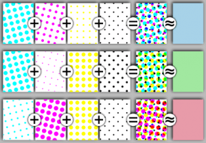 But as competent and sometimes as brilliant as the artwork was, the realities of the printing process still limited what the artists could do. The system of applying color was still mostly done by the printing companies using acetate and rubylith for their separations rather then separating the colors photomechanically. The cheaper grades of paper also hampered the final product with the courser grades suffering from “bleed”, that is that the paper would absorb the ink more readily into the fibers, causing the colors to mix and blur in unpredictable ways.
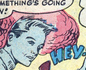 What did that mean in practical terms? It meant that art had to have well defined areas of color. The black and white inks had to present solid and definable shapes for the colorists to work in. Quite often the color separations weren’t perfect. Pick up an old comic book sometime and have a look at it. There are blocks of color and a lot of times the blocks do not stay within the lines. They overreach or overlap. The complex system of rubylith separations and screening meant that the art had to be somewhat simplistic. And printing companies were loath to invest in newer technologies, preferring to hire more color separators to do the work by hand. In the 1960’s and through the 1970’s this method was more cost effective than investing in newer techniques.*
All that would change in the 1980’s with the rise of independent comics and the introduction of a new kind of paper. I’ll get into that in part four.
*If you are interested in learning more about early comic book color there is an excellent article here that explains it more fully.
M. D. Jackson has been drawing since he could first hold a pencil. He has been writing for so long that he has, in fact, developed an alternate personality named Jack to handle the fiction.
His work has appeared in numerous magazines and on the front covers of many books as well as in the pages of Amazing Stories Magazine. You can also see a lot of it at his gallery.






Recent Comments