In just 2.5 weeks I’m going to be taking off for San Antonio, and LoneStarCon3 . . . along with a few thousand other fans. My convention experience, however, is probably not going to be like yours, if you’re planning to go. For one thing – when I’m not jabbering on a panel or kibbitzing with book dealers – I’ll be spending an inordinate amount of time in the art show, or meeting up with friends, fellow collectors and artists and buying them drinks. Or the other way around 🙂
Yes, I know. There’s tons of things to do and see at Worldcons. In fact, fellow blogger (and Hugo Nominee) Chris Garcia reminded me of that just last week. Unfortunately, Worldcons are not yet entertaining bids from convention committees located on Mars – so I’m limited to our earthly 24-hour days, and that’s just not long enough to squeeze everything in. Especially when – and by choice – I must spend so much time hanging out around art. Even so: it’s amazing to me how LITTLE of an art show I can actually end up SEEING. I’m not saying I don’t LOOK at everything – or at least, try to look at everything that’s on display. It’s that I don’t SEE everything. I attribute that to almost 40 years’ spent in perfecting the art of “selective seeing” (first cousin to “selective hearing”). I have to fight against my tendency to see only what I want to see, at art shows.

SELECTIVE PERCEPTION
I ADMIT IT. Not everything catches my eye. Hell, I’ll go further than that – and say that I am totally biased and opinionated when it comes to art. It has to “grab me” and make me want to look at it. And it has only seconds to do that. Because I’m quick. Yes, I’m really really really fast when it comes to observing and judging things….as well as people. So fast that I must make a concentrated effort to slow down when I’m buying art – even when I know what I like and tend to know it almost the instant I see it.
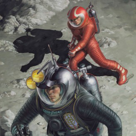
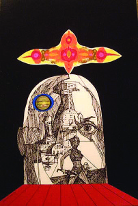
Book covers work like that – in fact are supposed to work like that, when they’re doing the job they were meant to do as marketing tools. Successful cover illustrations will make you want to pick up that book – almost without a conscious decision on your part to do it. So it’s no surprise that I look for that attribute in illustration art, which is pretty much the only kind of art we collect. 😉 I’m drawn to art that’s persuasive in the same way, that engages me, psychologically. It has to connect with me in some emotional way. I don’t have any interest in art that’s restful, pretty, or “has nothing to say.” But at the same time, I’m aware that selective perception is operating when I allow my tastes in art to limit what I “see.”

I can look at a whole room full of art and come away having actually seen only a handful of pieces. And then (and this can be almost as scary as the artwork) I can almost instantly act on my taste, and be totally confident in my decisions.
You know how social scientists and communication experts say that it takes only 10-15 seconds for strangers to form that first impression of you? – and that those seconds make a crucial difference in a job interview or first date? Well, first impressions work the same way with art. And just like with people….once that impression is formed, it takes three times as long for you to change my mind about it. 🙂
I think about this every time I look through an artist’s portfolio – representing (literally) years of their life’s work – in a few short minutes. I KNOW it’s unfair of me, but I’m already forming an opinion of their work by the 3rd image I’m presented with – leading to conviction in my valuation by the time I’ve seen only 5-6. Which has taken up barely a minute. Yet I have 20 more to go, and if I keep going at that pace, I’ve insulted the artist. In the same way I can seem to breeze through venues as seemingly disparate as flea markets and Museum exhibits, if nothing there seems to catch my eye. Sometimes I do go back and look again at a piece I’ve dismissed earlier. But that’s rare. Once it’s “over” for me, it’s generally “over”.
SEEING BEYOND ONE’S BIAS
Certainly I can be objective about this. My tastes are not yours! If they were, art shows would be the boring-est places in the world to view art!!! Not to mention, making it a waste of time for you to ask me my opinion on art, or for me to be an art show docent leading tours through the art show at Worldcons. So, of course. When asked to judge art on its own merits, I can put aside my personal, subjective reaction to what I’m seeing. Or, perhaps more precisely, I am able to integrate or “mesh” my perceptions with what may be yours, to come up with a more balanced view.
I’m not saying this doesn’t take effort, but I’m pretty good at suspending my judgmental tendencies, and suppressing my inclination to ignore or filter out imagery that I don’t find attractive, when it comes to picking stuff that YOU might find appealing. There are collectors out there who hate me for that, because they know I’m going to come up with something they can’t resist, and it’s going to be expensive 🙂 BUT If I know you and your tastes, how can I not know what you’d like? And I wouldn’t have fared very well as an artist’s agent over the years if I didn’t respect our differences in art. It’s important – if not a job requirement – to be empathetic in an environment that thrives on individuality, autonomy, difference, distinctiveness, and all things unconventional.
SEEING EYE TO EYE (The Eyes Have it)
Ok, so what gets MY attention? I think it’s vital for a book cover illustration to establish an immediate and direct connection with the viewer.
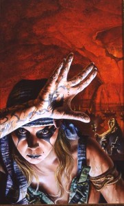
And I think one of the best ways to do that is “eyeball to eyeball.” Artists who choose this direct – and dramatically intense – way to approach a commercial assignment is counting on the power of that visual punch. Nothing hidden or hinted at; nothing mysterious about it. The message is assertive, and clear. It’s a picture that demands your attention and participation, there’s nothing desultory about it. I’m talking about the kind of image that stops me in my tracks, that forces me to acknowledge its power. It doesn’t have to be beautiful, its beauty lies in its strength – an image too strong to be ignored. That’s why it appeals to me, both as an illustration and as a work of art.