The biggest challenge to self-publishing, I found, was creating covers for my stories. Using the native Mac word processor Pages, formatting stories for epub version is a one-click process. Even doc files are easy to produce cleanly. From the things I am told, it’s harder to make a clean file using Word, and I know from experience that Open Office files are difficult at best to work with. I have used both Sigil and Calibre for formatting, but find that I can get the files prepped without them, especially when it came to Smashwords.
For the first few SF stories I published, I used a fractal generator to create background interest, then superimposed the title and my name on them. Done, super-simple, right? not really. When designing a book cover, there are some basic rules that must be obeyed. First is aspect. Take a look at a book nearby (I have shelves of them at my elbow, I’m guessing you are similar) and note that it is taller than it is wide. Remember that, and when you create your image file, set it up at 6” x 9” for greatest utility. Second rule applies to ebooks more than print. The covers must be legible in thumbnail size. No ornate fonts, contrasting colors, and make your text as large as possible.

I’ve had training in graphic design, and in marketing, but neither come as easily to me as writing fiction. Designing the cover for Vulcan’s Kittens was my biggest challenge, as I didn’t want to use the fractals I had been using for the SF short stories. Fantasy, which VK technically is, ought to have art on the cover. After starting the editing process on the novel, I went on to write more short stories and novellas, and published one recently with my own watercolor art for the cover. For Vulcan’s Kittens, though, I wanted something more contemporary to match the story. I wound up using a photograph I had taken of one of our cats and making digital adjustments to it, including a digital painting of a volcano on it (Never again. Painting with a mouse was an exercise in frustration) and I have gotten good feedback on the cover, so I think I succeeded in my goal.
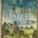
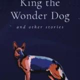
Covers are important. We really do judge a book by it’s cover, and each genre has its built-in expectations. SF is usually photorealistic, slightly digital art, fantasy is more classic art. Only if you are writing contemporary genres can you get away with photographs. An ebook appears first as a thumbnail, so a less-detailed cover is better, with any text on the cover oversized for better visibility. So many little things to remember and incorporate. Look through ebook covers, find some you like, and make notes on what you find attractive.
I will talk more about programs for graphic design, and the requirements for print covers, especially for Createspace, next week. In the meantime, start compiling ideas. There are some super blogs out there that cover this in detail, and it’s always good to get more than one source when researching, in anything you’re doing.


