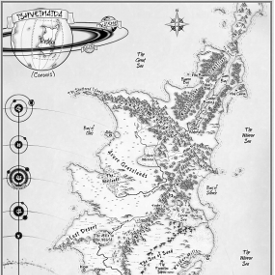
If you are traditionally published, you probably will have little (or no say) about the cover of your book. If you are self-publishing, then you have the added advantage of getting a cover just the way you want it. But with that power comes the responsibility to create a cover that will elevate your book from the self-publishing morass. Nothing is more important to attracting people to your book than the cover and hopefully this post will help you make yours the best it can be.
The most important thing
If you forget everything else in this post remember this: You must make your cover indistinguishable from books coming out from a traditional publisher. Most readers don’t care what imprint is on the spine of a book, but many do care whether it is self-published or vetted through a traditional publisher. If you have a good enough cover, they will assume it is traditionally published, and as such you’ll not have to convince them to give a self-published book a try.
Creating your own covers
Usually you’ll have to hire a professional to get this type of indistinguishably. Although some self-published books have had covers created by the authors that also fit the bill. Let’s take a look at some:
The first one was created by myself, back when I was self-publishing my novels. The second one was created by the author India Drummond. If you have the design skills to make covers that look like this, then by all means, save yourself some money and do it yourself.
Hiring a designer
For the vast majority of authors, they’ll need to hire a designer, and not all designers are created equal. Here are some covers that have been hired out that I think were well worth the money.
The first one was created by Damon and the second from an artist that the author found on Deviant art (more on where to find artists in a minute). They paid between $150 – $395 for these covers and I think they money was very well spent.
How much should I pay?
Like professional copy editing, the price for cover design can vary widely. When I decided to self-publish my Hollow World novel, I hired one of the top artists in the industry (Marc Simonetti). I’m not sure if Marc would be comfortable with me stating the exact price I paid but I will say that it was more than $1,000 but less than $2,000. Other high end cover artists that are used by the big-five will come with a similar price point. For me, paying that price wasn’t a problem (I had done a Kickstarter to raise funds for exactly that) but I wouldn’t recommend that a new an un-established author pay that much. Keep in mind that as the publisher-author you have to keep an eye on profitability and the best way to do that is to control costs. As we saw in the section above, there are those that will produce quality work for a few hundred dollars. I suggest that you budget about $350 – $500 for a cover an you can certainly get something very good for those prices.
Where do I find cover artists?
Finding artists is really quite easy. Here are some places I recommend:
- Ask other authors: The best way to find cover artists is to find a book that you like the looks of and simply send the author an email. Authors love their artists and are more than willing to send more work their way.
- Artist sites: By far my favorite here is is deviant art. You can spend hours combing it and there is some amazing talent there.
- Author sites: Places where authors gather is a great place to find professionals servicing them. For instance, there is a yellow pages on the Writer’s Cafe of the Kindle Boards where cover designers post samples of their woks.
- Take my recommendations: Whenever I see an artist that is producing quality covers, I add their contact information to a file. I can then query some of them next time I have a cover need. Here are some of my low cost favorites: Damon | Extended Imagery | Indie-spired Design | Eamon O’Donoghue. If you have a bit of a higher budget then I would recommend: Marc Simonetti | Chis McGrath | Andreas Rocha. All of these are producing covers for the likes of myself, Patrick Rothfuss, Jim Butcher, and George R.R. Martin.
Some notes about typography
Just because you find a great artist, doesn’t mean you’ve found a great cover designer. One of the things that all the covers I’ve shown have in common is a really good eye for the lettering used. Don’t just hire an artist and think you can slap some text over the picture yourself. Good typography takes a skillful hand just as creating the image. Here are things to keep in mind:
- Poor Kerning – Kerning is the space between letters, and it is almost always a good idea to reduced this space. If you just type in a title and leave the kerning at the default, it will almost always look amateurish.
- Complicate fonts, or too many fonts – Too often I see covers using several different font faces all at once. This is almost always a bad idea. When in doubt, simpler is often better.
- Varying sizes – Notice in the examples above with multiple words that there are different sizes. The “of the” in Indra’s and David’s book are small, and Crucible is smaller than Souls on Mitchel’s book
- White space – I always prefer when the key elements (title, author’s name_ have a nice amount of space around them. You should never have text that goes right to the edge (and especially not bleeding off on the top and the bottom). For an ebook you could get away with this but if you have a physical book the printer will always require some safety area between the edge of the book and any active text as they won’t be able to guarantee where the cut will occur.
Wrapping it all up
As already mentioned your cover is critical to the success of you book. Your job as a author-publisher is to ensure a cover that is indistinguishable from those put out by a traditional publisher, and watch your bottom line so you can start earning a profit in a reasonable amount of time. Keep in mind that as your book starts to earn, you can upgrade your books cover, and I know many self-published authors that have gone through several iterations as more money became available. But even after saying that, don’t start with something that is unprofessional as you’ll likely never see any income to provide that upgrade.
Michael J. Sullivan is a speculative fiction writer who has written twenty-five novels and released nine. Eight of his fantasy books (The Riyria Revelations, and The Riyria Chronicles), were published by Hachette Book Group’s Orbit imprint. Hollow World, a science-fiction thriller was released by Tachyon Publications. The first four books of his new series, The First Empire, has sold to Random House’s Del Rey imprint, and the first book is scheduled to be released in the summer of 2016. He can be found on twitter, through his blog www.riyria.com, and on his facebook page and his publisher’s page for the series.


