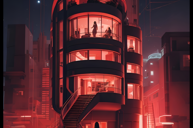
Today I’m covering a topic that has been covered many times before, but I’m not sure everyone has seen it, so here goes nothing. And I’ll give you pictures!

We do judge a book by it’s cover. The cliche about people is “don’t judge a book by it’s cover” but have you ever thought that shouldn’t apply to an actual book?
There’s a paranormal romance cover that just makes me go wha? Dude has fire where no guy wants to burn!
now speak to the classics, the free books that are being made available on Amazon and elsewhere, but at one time that is the style of cover you would expect on your novel. No indication of what lay inside. I’m not sure quite when the dust jacket came into being, with it’s colorful evocation of the stories inside, the promise of art or image that spoke to the potential reader of genre. A cover image, in a single glimpse, could speak a thousand words about the story inside, or at least that is the intention of the creator.
In order to convey this, you need to first study the genre you are trying to evoke. For a science fiction story, you need art, not a photograph, and although an icon will do, you want to avoid this sort of thing.
This cover just makes me think the writer hadn’t got an idea about what they were doing.
A good cover can grab a reader and make them look closer. Like this cover, where the art to me evokes the covers of Golden Era science fiction. I’m interested enough to go ahead and put the book on my kindle to check out further (it’s free!)
Some will say that you can get away with no art at all on the cover, but this example makes me doubt how effective that is. When I first saw it, I thought the author’s name was the title, and putting novelette (a term many readers don’t know) on the cover is unnecessary, that belongs in the blurb.
I’d get more into the topic, but I haven’t got time to plumb the depths of Amazon. Instead I recommend that you do. Look at the genre you picked for your story, and see what the bestsellers are (taking out authors like RR Martin and mega-bestsellers, who can sell on the author’s name alone) and look at their covers. Keep in mind that most ebooks will be viewed at a very small size of image initially, and design yours to look good at thumbnail, then full-size. Stick to the recommended proportions. A square cover image will scream amateur in the bookshop, unless it’s a children’s picture book…
Next week: how to find art you can afford and use legally on your covers, without shelling out the big bucks.


Recent Comments