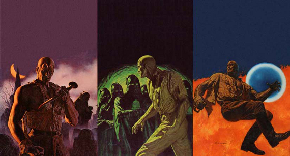
 James Bama single-handedly introduced the entire world to Doc Savage (he and his editors at Bantam Books and art director Len Leone). Doc Savage, as most of you know, was the greatest of the pulp heroes of the 1930s who eventually faded away after World War Two (along with the other great pulp heroes, The Shadow, The Spider, G-8, Operator 5, Dusty Ayres, The Phantom Detective, even Tarzan). The invention of comics and the appearance of the first cheap paperbacks in 1949 also helped.
A decade and a half later, in a different era In 1963, the editors at Bantam Books (who were also part of Conde Nast’s publishing empire, the owners of the Street And Smith pulp heroes) decided to do two things. One was to reprint the Doc Savage stories as stand-alone novels, and, two, to do it as a numbered series. This had never been done before in the history of publishing and it was risky because there were 181 Doc Savage novels published between 1933 and 1949. They didn’t know if they would even do the whole run. So they started off publishing the best of them.
For a cover artist, they decided on James Bama who was a long-time paperback illustrator and Western artists. Bama turned in his cover illustration for The Man of Bronze but the editors didn’t like his representation of Doc Savage. You can Google the original image: That image had Doc sporting a ripped shirt and golden muscles, but he had brown hair, combed in a rather ordinary manner. (Bama’s model for Doc was Steve Holland). They sent it back to Bama wanting a more “modern” look, and Bama sent back the image we now know of the blond hair (it later became something like a skullcap or helmet) with its exaggerated widow’s peak. Through all of the digging by Will Murray and other Doc Savage scholars, we now know that Bama did the first cover (to The Man of Bronze) and the second to The Thousand-Headed Man but left on his honeymoon and other artists did the covers to The Polar Treasure, The Lost Oasis, and The Brand of the Werewolf. After that, James Bama returned and made publishing history. The series took off and even though Ace Books was reprinting the Tarzan (and other Burroughs) books and Lancer had the Conan stories going, Bantam Books had brought the pulp era to the fore in a big way to a generation that had never known the pulps–my generation.
Bama’s covers tended to be monochromatic using just one basic color and a lighter analog. The covers to Hex and The Czar of Fear above are such examples. Bantam also did not allow any other wording or blurbs to interfere with the cover. Thus, they wisely allowed the enigmatic art to draw the potential reader into the world that the illustration suggested. Bama’s hyper-realism is quite akin to the photo-realism of Andrew Wyeth. (Bama himself acknowledged that he painted from photographs and you can see ever crease, rip and tear of Doc’s shirt because of it. They used the same shirt on Steve Holland for years until it fell apart.) Bama’s last painting for Doc Savage was for #64, The Freckled Shark. On a side note, Bama wanted to paint Doc Savage in different get up, but Bantam stuck to the now-iconic image of Doc, fists clenched in a ripped shirt. However, there were times when Doc was allowed different garb as in the cover to The Mystic Mullah.
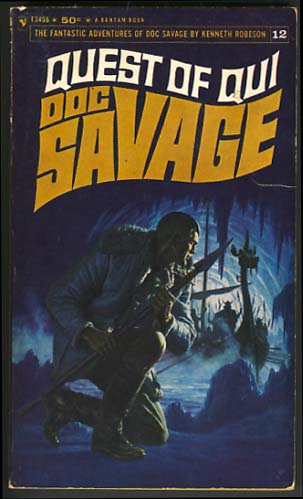
 I was 15 when I discovered Doc Savage, but it wasn’t because of the Bama covers. I saw a nerdy kid reading a copy of The Lost Oasis in study hall when I was a sophomore and because I didn’t respect this kid, I disrespected what he was reading: a book with some guy in a torn shirt shooting at vampire bats. It was the cover to The Lost Oasis which had been painted by another artist. But that following summer I saw a copy of Quest of Qui and I was blown away. Here was this guy, crouched down in a cave holding a short spear while actual Vikings were floating into the cavern on a dragon ship. In contemporary America!
Now I didn’t know then that these books were published almost twenty years before I was born, but they were exciting reads and the writing style of Lester Dent–streamlined and colorful, lent just the kind of excitement a kid needs during those awkward years. I looked forward to Doc Savage coming out every month, and I can still remember what was happening in my life when each book came out.
You can see the other Doc Savage covers at my own website (www.paulcook-sci-fi.com) and you can see other James Bama art online. Bama later said that he felt that he was responsible for making Doc Savage a success. A number of my Doc Savage friends here in Arizona resented him for that, but he was correct in making that claim, just as Bantam Books was savvy enough to know that a change in Doc’s hair was important to update the character. My Doc friends have since gotten over their original resentments and we all live with the covers. By the way go to www.graphittidesigns.com if you’re interested in getting the prints that Bama allowed them to reprint. Some are even signed by James Bama. I have the one to Red Snow which I will treasure forever.
–Paul Cook


Recent Comments