… a beloved brand makes a very bad choice.
I work with watercolors. I am a painter of many things and user of all kinds of paint, but if you asked me, I would say I am primarily a watercolorist.
When I first started studying art at a college level, I would not have said that. Watercolors were my archenemy. I saw the beauty in them, but could not control the stuff worth a damn in high school. Well, at least not to my liking, but that’s another post. Certainly not on par with what I could do with oils & acrylics at the time.
I didn’t really make friends with watercolors until junior year at the Hartford Art School, in a class called Color Illustration. The first two projects were to be done in watercolor, and I panicked on the inside. But clearly, I survived.
One of the critical factors was switching to tubes of moist watercolor, rather than hard pans. Another was using The Good Stuff. We had to buy tubes of Winsor & Newton (professional grade, the Cotman student series wasn’t even around then, I don’t think), a selection of maybe 5 or 6 colors. Those weren’t the only factors, but they certainly got me moving in the right direction. I still started to make a mess on that first project, and the teacher, one of my favorites to this day, said, paraphrased because it was ±26 years ago, “ok, let’s let that dry, and I’ll be back in a few minutes, and I’ll show you another approach.”
And that’s what he did. He came back a few minutes later after my mess had dried and showed me another approach, and I went on to finish the painting –

– which got into the Society of Illustrator’s Student show that year.

Years later, going to grad school, I learned how to make watercolors do this.
I’m not showing these to brag, I just want to establish just how important watercolors are to me, and how meaningful my relationship with that brand is.
For close to three decades, I have been buying tubes of Winsor & Newton Professional Watercolors almost exclusively, with very few exceptions. There’s 2 or 3 colors where I like Holbein’s formula better, and I use Marie’s for goofing off, and Marie’s Chinese set for my brush painting. Plus I’ve tried a few samples from other brands acquired at various promotional events. But I’ve bought a LOT of Winsor & Newton watercolors over the years.
I had to buy some watercolors last week. Just a few tubes, to replenish what I’d used up.
Winsor & Newton watercolors are kept in a locked case. Well, at least the professional ones are. They come in tubes of 5 ml, 14 ml, and 37 ml. I generally stick to the 14ml, unless i’m trying out a new color, then I’ll buy it small first. It’s maybe the size of a tube of Clearasil, and they range in list price from about $18 to $29, depending on the pigment. I rarely see a store actually selling them at list, but even so, even 50% off list is $9 to $15, so… I tend to wait for a sale to stock up.
So, while shopping at Jerry’s Artarama in West Hartford, I got a guy to open the case. He pulled out the colors as I named them off. He then took them to the counter while I finished my shopping. Pretty standard experience.
At check out, the woman rang them up & put them straight in the bag.
I mention all this to make the point that I didn’t lay hands or eyes on them really until I got them home. Even pulling them out of the bag and plopping them down on my drawing table, I didn’t really look at them, not until I went to do some prep that night for painting the following day.
That’s when I noticed it: They’ve got a new label design.

What’s wrong with this picture?

Not sure? Here’s what the labels have looked like since I started buying them in freaking 1989

Still not sure? Here they are side by side.
Note how on the old design, the color bands go all the way around the tube, on a white background.
And note the new design, with its flashy reflective metal background and the one little swish of color on the front.
The more time I spend looking for a specific color, the less time I paint.
At a glance on the old design, I can tell which colors are what no matter how they’re situated. At a glance, even if the new ones are face up, I have to look closely to figure out which one each is.
Who the %#$@ approved this design? I’ll tell you one thing for sure: not a user.
Sure, the official pictures on websites look great, taken by professional photographers who had to go out of their way to eliminate the shine and reflection so you could see the damned writing and the clever little color swoosh.
This is what this stuff looks like in its natural habitat, in use:
Note the design of the other brands mixed in there.
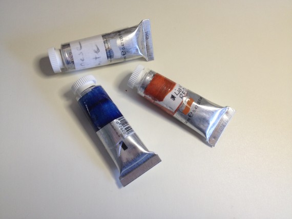
I considered returning the tubes to Jerry’s as soon as humanly possible, but I’d planned on shutting myself in and painting until I couldn’t paint any more. Plus, Jerry’s is a hell of a hike as I’m currently living out in farmland. So, if I wanted to paint, I had to use these three tubes. And in order to use these three tubes, they needed a makeover. A little paint on a strip of paper, a pen, and some clear packing tape, and voila! I can work with this.

Problem solved for now. I didn’t intend to cover up the logo, but it’s a side effect I could happily live with while I simmer in my displeasure. But I’m not going to do this with every tube of paint I buy. I plan to start trying out other brands as needed, each and every time one of my other W&N tubes needs replenishing.
I am, quite frankly, aghast that they could do something like this and not even consider the user experience. I imagine some douchebag consultant just out of online biz school who never used the product coming in and telling them the needed a sleek, hip 21st century design or something. F*** that. I don’t care what they look like, as long as I can use them. As long as the design doesn’t stand in the way of my productivity. Aghast. I assure you, my initial rant about this, privately to a friend, was WAY more… colorful, in terms of word use.
Regardless of how it happened, it happened. And after 26 years of loyal use, and a hell of a lot of painting. Winsor & Newton stands to lose my paint business. Holbein already has some of my money, I might have to use them for all my needs now. Or maybe I’ll see what Daler Rowney or Daniel Smith are all about.
Apparently I am not the only one who doesn’t like it much:
https://birgitoconnorwatercolor.blogspot.com/2014/01/can-you-read-new-winsor-newton-label.html
https://www.parkablogs.com/picture/winsor-newtons-2013-new-tube-packaging-redesign
And yes, I’ll write to the company before I commit to taking my business permanently elsewhere. It seems to be a slow roll-out, as they started using the design in 2013, and I only just noticed. The tubes can sometimes last a few years for me, depending on what I’m painting and how often, so there you go. I’ve looked at a selection in the case at a store since my last purchase, and it’s still a mix of old design & new design.
We’ll see how it pans out.
But in the meantime: if any watercolorists out there have experience with a different brand, please, I very much would like to hear your 2¢.


Recent Comments