 Pedro Marques was born in Luanda (Angola) in 1971. He works as graphic designer, translator, publisher (Livros de Areia, Montag). He’s sort of bored with big bookshops because they show less and less the work of genuine publishers or booksellers, being instead highly paid fronts for big corporate publishers’ marketeers and window dressers. He prefers second hand or flea market bookshops and bakeries, where those selling the bread know how to make it and like to eat it as well.
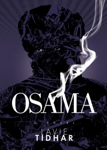
The sound of the doorbell when the postman brings him another 40 or 50-year old paperback is music to his ears. He works as a freelance for publishers in Portugal and the UK. One of his covers was chosen to be presented at the 2008 international exhibition of contemporary book covers “Gateways” (held in Porto). Another, for Lavie Tidhar’s Osama (2011, PS), earned him nominations for Best Art award at the 2012 BSFA British Science Fiction Association Awards and Best Cover Illustration award at the 2014 Prix Imaginales.
Still, one of his biggest thrills was when his design for a cover in Portugal was used in the Argentinian edition of the same novel: somehow having his work shown on Buenos Aires’s bookshops filled him with a satisfaction he cannot quite fully explain. He has published texts on book design and publishing in Portuguese and Brazilian magazines. He lives in Lisbon and edits the blog Montag (montagbytheircovers.com).

John Dodds for Amazing Stories: Hi, Pedro, and thanks for agreeing to this interview. Your work first came to my attention through the superb covers you did for Lavie Tidhar’s God books and, more recently his novel, The Violent Century (PS Publishing). I was struck by their uniqueness, their mythical quality and the way you mixed primitive and modern in the art and the typography. How did you get involved with these books and how do they relate to what inspires you generally?
PM: Lavie’s Cloud Permutation was the very first one of his books I did the cover for, as well as the whole design. It was through PS Publishing, who published it. I remember I liked the title a lot, it had a very beautiful, mysterious and at the same time rigorous, almost scientific sound to it. So it was a simple job coming at me from the publisher – I did not know Lavie or his work prior to that – but also a rare opportunity to provide the cover art on top of the graphic arrangement. I ended up making all of Lavie’s PS books, including the one for Osama, which eventually got way more attention than I was expecting, especially being such a simple cover. Sometimes, like in Osama or The Violent Century, I aim for a more iconic, synthetic image of something that we might pompously call the “zeitgeist” (the blind violence of Al-Qaeda—which pre-dated ISIS—on the former’s cover, the artifacts of total war that form this mutant, hideous entity on the latter’s); sometimes I go for specific details or descriptions in the text, as in the covers for Martian Sands or the Gods books. But apart from Lavie’s books, I must state that Nick Mamatas’ The Last Weekend, for instance, was a blast to make (providing me the very rare opportunity to make a homage to one of my favourite films, Philip Kauffman’s remake of The Invasion of the Body Snatchers) and I was very satisfied with the whole look and finishing of Kathleen Ann Goonan’s Angels and Dogs and Rosanne Rabinowitz’s Helen’s Story.
ASM: Having myself worked in the arts for many years (I even did some graphic design for theatre and dance companies at one stage), I noticed references in some of your work to stuff from the past, such as constructivism, and even 1960s hippy rock posters – I may be wrong, of course, but please tell us more about influences.
PM: Since I’m not a draughtsman or a painter, I go for what graphic design historian Phillip Meggs called the “conceptual image” by means that are akin to that graphic arena, mainly collage and image manipulation (or photo-montage). In short: creating new and valid images out of the flotsam and jetsam of old or “found” images. So pretty much from Dada onwards is a valuable reference, especially John Heartfield’s montages, the Surrealist collages of Max Ernst, the collages of Daniel Mroz, the work of Czech avant-garde artists like Styrsky, Teige or Hoffmeister, some of the great Czech and Polish film posters of the 1960s and 70s and so on. If had to pin it down to a name or two, I’d say Roman Cieslewicz for the image building and (Robert) Massin for the book design. Since we’re also specifically on the theme of Science Fiction or Fantasy, I’m also very fond of that style that went against the grain and away from the genre tradition of naturalistic or realistic art on the covers and took on these avant-garde influences, most notably during the “New Wave” period (mid-60s to mid-70s): things like the Penguin SF covers under Germano Facetti’s art direction (Franco Grignani’s ones being quite outstanding) continuing under David Pelham’s (his SF covers were—and are still—just amazing), Panther’s paperbacks, some of New Worlds magazine’s covers, some of Doubleday’s Science Fiction series’ covers, the covers Terry James did for the London Science Fiction Book Club, even some of Richard Powers’ and the Dillons’ wonderfully expressionistic art. To name a few examples outside the Anglo-American canon, I’d add the superb covers in the SF series “Chute Libre” published by Champ Libre in France in the 1970s and Argentinean publisher Minotauro’s covers during the 60s up to the mid-70s.

ASM: What techniques do you use in your work? I see what appears to be collage as well as original illustration. And do you work purely analogue or digital, or both?
PM: Since I’m not what the industry calls an “artist” (no hard feelings: I’ve never intended to be one in the first place), I rely mainly on manipulating found imagery with the intent to create a final image that does justice to the book and/or the author’s intentions (as I understood them) and that manages to have a sort of uniqueness of its own. I’ve done some work partly from drawings that I inked and then scanned and treated in Photoshop, but I’d say that’s really not my “area of expertise”.
 ASM: Graphic art has undergone periods of highs and lows, such as publishers electing to use photography more than illustration, and the devaluation emerging with the idea that anyone with a computer and PhotoShop could produce art. Where do you think the industry is now, and can you see the nature of graphic arts being radically different now and in the future as a consequence of all this technology – not to mention the rise of ebooks.
PM: Breaking down your question in two, I’d say:
1) I don’t see any opposition between “illustration” and “photography”, being the former a better choice and the latter a worse or at least a “lazy” one. Any cover from the Panther SF paperback series of the late 60s, with their abstract details of photographs, will be better than most of the illustrated covers done ever since. Bad illustration, in SF or, especially, Fantasy, along with appalling typography, is way more detrimental than any choice of a good photograph and well laid out type. Take the example of Sanda Zahirovic’s covers for Gollancz SF series of space operas: just playfully folded or torn white paper well photographed against a stark black background. You could throw at them all the best artists’ work of huge planets and spaceships; in the end, you’d still remember those covers over the rest. It all comes down to create something that stands out from the competition (even going full B/W if necessary, the return of which, by the way, I’d welcome) and that shows some originality and personality, making use of all or only some of the tools available (photography, illustration, typography). Of course, if the genre publishers or art directors are not willing to go this bold way, we’ll end up with the same “big ship hovering above huge planet” covers.

2) In the same way, I don’t see the easier and broader access to the digital graphic tools since the 1990s as a negative thing. Graphic design is not meant to be an activity exclusive to an enlightened elite; in fact, it’s meant to be the exact opposite, provided a multidisciplinary culture of learning is maintained and a constant investment in the importance of cultivating oneself and, through one’s work, helping customers and general public to do so as well. If having the latest edition of Creative Suite doesn’t automatically make you a “designer”, knowing and reading only about the tools of the trade and mingling only with other designers without expanding your intellectual canvas will make you one hell of a boring designer, even if you come with impressive academic references.
ASM: Clearly you do graphic design for a lot o
f genre works (novels by Dan Simmons, Brian Stableford and others). Did this come about by accident or….no pun intended….design?
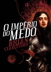
PM: It’s totally accidental. I don’t work in a specific genre, I work for any publisher that wants or  needs my skills. The bottom line is and will always be to respect the text and to try to give it a visual presence that doesn’t embarrass the author and the publisher. The public, because of its vastness and complexity, I don’t pretend to humor: some will like the cover, some (maybe most) won’t. And, to be honest, especially in genre fiction, like SF, I think it’s better not to even try, a statement I’ll illustrate with a true anecdote. For the latest Portuguese edition of Brian Stableford’s The Empire of Fear, I picked one of Van Dyck’s portraits of English noblemen of the 17th century. It had all I thought was needed: the feel of the time, the mood, an amazing face and a striking detail in a blood-red scarf around the man’s arm. I only, ever so subtly, worked on his eyes, mouth, skin tone and fingernails to give him a realistic look of a “vampire” or a person one could actually take for a vampire. Not, of course, an “old school” vampire in the Hammer films tradition, nor one with the more radical looks of Max Schreck or Klaus Kinski in Nosferatu, but a man of power and prestige with a particular affliction that seemed to add to both. Well, I found some negative feedback on the cover based on the fact that the vampire was “too scary” and the cover “too dark” (both literally and figuratively, I guess). Why, I asked? Isn’t “scary” and “dark” something a vampire should be? Well, apparently I had forgotten the very recent rule that vampires had to look like Robert Pattinson and be cute, cuddly and make women faint in a 19th century, Dixie colonial ballroom, Gone With the Wind sort of way. So the lesson would be: ignore what the “public” or the “fans” want if you can afford it; it’ll make you happier.
ASM: Are there any types of graphic design project you haven’t worked on that you would be most keen to undertake?
PM: I remember telling Lavie that, if a suitable budget had been available at the time, it would have been amazing to do produce Osama in a variety of papers and printing techniques that would do justice visually and graphically to the narrative’s multilayered nature (inserting a simple typewritten leaf of old, thin paper in place of a short chapter that consists of a single paragraph of typewritten text, for example). That sort of thing is still what makes the physical book such an exciting medium, and if it is used not just as show-off but to really help the reader connect even more with the narrative then it’s like magic.
ASM: What genre work do you enjoy currently? Feel free to talk about books, films, anything.
PM: I liked the pilot for the Man in the High Castle Amazon series, although I was a bit reluctant at first, especially because it had too little of Tagomi (the intro is quite amazing, though). It came at a time when Mad Men was still boiling hot on our heads, and I think that it can explore some of the same retro fascination with the late 1950s, early 60s albeit in a distorted way. Good indie SF films are sprouting with some regularity, making us forget the monstrosities too much CGI, bad writing and an unhealthy obsession with super heroes that have been made in Hollywood. Ex Machina and Predestination were remarkable, especially the latter. Fury Road was also, amazingly, getting everything right even its smart jabs at the brutal capitalist ethos of today (Immortan Joe rebranding water as “aqua cola” and shouting to the miserable crowd beneath that they should avoid getting “addicted” to water). In fact, it’s such an exciting film in the mixing of kinetic spectacle and some of the tensions of our days (the exploitation and theft of natural resources to benefit a small elite of rulers over the rest of us, the growing realization of an inexorable climate change, etc) that one suddenly has the idea of what it must have been to watch Planet of the Apes in 1968, after the missile crisis, the end-of-the-world paranoia, the huge riots and the racial tension in the USA.
 As for books, I’d like to see one exploring the connections, intertwinings and tensions between SF imagery and Surrealism and other visual avant-gardes of the 20th century. There’s even someone who could write it very well: Rick Poynor, the graphic design historian. For the moment, as the ones Stanislaw Lem writes about in A Perfect Vacuum, this is a book that exists only in the wish list of my imagination.
ASM: Can you tell us about the projects you are currently working on and in the future you feel would be of interest to Amazing Stories Magazine readers?
PM: I believe there’s another title by Lavie on the horizon, although I can’t quite be sure about it. What I’m mostly into right now are a couple of projects I’m designing, writing and publishing dedicated to some of the “forgotten heroes” of Portuguese publishing (via Montag, a trademark I created for that: www.montag.com.pt). The one I’m hoping to publish this year is the first book dedicated to Fernando Ribeiro de Mello, a maverick, impetuous publisher who was known in the 60s and 70s as the “Dali of Lisbon”, and who published the Marquis of Sade and other erotic literature during the last decade of the hard-line right wing dictatorship that ended in 1974 (he is also remembered for famously presenting four books, including an “adult version” of Alice in Wonderland, while inside a giant tub full of soap bubbles). He had a keen eye for graphic design and commissioned amazing illustrations, including some in the fantasy and SF genres.
ASM: To conclude the interview I asked Lavie Tidhar for comments on Pedro and his work as a collaborator on his books.
Lavie Tidhar: It’s been a privilege to have Pedro as my artist on all the PS Publishing books. Not only does he design the most unexpected (and, in the case of OSAMA, truly iconic) covers, but he designs _everything_, from the endpapers to chapter headings, giving the books a unique, artist-led look. In this world of electronic books, it’s easy to forget that the physical book itself can truly be an object d’art, and I’ve been truly fortunate to have both PS and Pedro work so hard to make these beautiful objects come alive.


