Shawn King’s work first came to my attention through the covers he designed for my Adventures in Scifi Publishing colleague, Tim Ward’s Scavenger: Evolution book, which I found so arresting I had to seek out more. He’s the in-house designer over at Ragnarok Publications, a post he took up in June 2014. For Ragnarok, in his own words, he does “much every type of design/imagery/logo, with a couple exceptions. Book covers (mostly designing around commissioned artwork, but I’ve done a few by myself), interior layouts for print copies, company logos (Ragnarok, Angelic Knight Press, Per Aspera Press), promotional graphics (FB headers, splash graphics, inserts, etc.), even coin designs (for Blackguards and for the GnomeSaga series).”
More about Shawn. He is a graphic designer, specializing in print media, reclusively residing in the state of Mississippi. He earned his degree from Meridian Community College in 2007, but it is said that he taught himself everything he knows. In 2011 he began working for Legends, a Mississippi arts and entertainment magazine, which is distributed throughout the entire state. He quickly became lead designer — completely re-branding it into the publication people from all over the state (and steadily throughout the country and beyond) love today — and currently holds the title of Creative Director. Legends won the 2013 and 2014 Mississippi Tourism Association’s Travel Media Consumer Publication of the year.
 John Dodds for Amazing Stories Magazine: I confess I am never entirely certain what the term “graphic designer” means – I take it to be a portmanteau phrase which can incorporate everything from applying typography to existing imagery, designing logos and doing publication layout. In your case, it also means doing illustrations too, in some instances. Where do you see yourself on the “graphic design” spectrum?
Shawn King: First off I have to say this my first interview like this, so you’ve been warned if I meander off. “Graphic designer” is a pretty broad title. It encompasses many aspects, but everyone has their own niche, their own specialty that sets them apart. When I landed my first big gig—the magazine that I’m still currently working for—all I knew was print/editorial layout…or so I thought. It wasn’t until later that I realized I had an eye for some of the other areas of design as well: posters, flyers, invites/stationary, business cards, Facebook headers, etc. When Joe Martin brought me on at Ragnarok Publications I found out I’m pretty good at publisher logos and book design as well.
As far as illustration goes, I’ll leave that term to the actual illustrators. The cover art I do is more photo manipulation. I still hold a bit of talent when there’s some graphite in my hand, but it isn’t what pays the bills.
I don’t think I actually answered your question…where do I see myself on the “graphic design” spectrum? I don’t think I can justly answer that one, I’m just enjoying what I’m doing.
 ASM: When I trained as a journalist, I occasionally needed to do some page layouts, back in the days of hot lead and glue sticks. And I’ve used letraset in poster design when I worked in the arts. Did you have any experience with the sticky-fingered old-fashioned stuff? And what’s your process now – is it a combination of manual and digital or purely the latter?
SK: Ha ha, nah, no old-fashioned stuff for me. The closest experience to that I have is from working at the local newspaper here (still my day job) and having to cut and mask negatives on occasion. My process is 99% digital. I, sometimes, will loosely sketch out an idea when it pops into the ol’ noggin, although those ideas almost always get altered once I start the layout process. I also sketched out the icon of Jörmungandr (the World Serpent) for Ragnarok’s logo.
ASM: I love great typography and Neville Brody of the UK’s Face magazine is one of my heroes. Who has influenced you and what’s your opinion about typography and how it’s used (or abused) these days?
SK: Since I was introduced to the fantasy fiction genre I’ve always been captivated by the covers—seeing that they weren’t afraid to go outside the box. I’d have to say that fantasy covers were always my influence and helped lead my style to what it has become.
I feel typography is very important, and directly conveys the message of communication design (or graphic design). The chosen typeface/font should reflect the intent of what you’re working on and not cause confusion to the consumer or audience, but it can be seen doing that more often than not. The biggest issue I see is too many fonts being used together—you don’t want the words of your message competing with each other (that suggestion can sometimes be thrown out if you’re making a piece of art that is solely typographical).
I also see a lot of book covers that seem to just throw typography out the window, slap a clean serif on some great art and be done with it. I know the art (and author, if big enough) will sell the book, but I’d like to see more creativity put into the design process.
ASM: Your main work seems to be in genres such as science fiction and fantasy. Do you come from a love of the genres initially, and seek to work in these fields, or was it more accidental? Can you name some of your favourite artists, books or films and say what you like about them.
![]() SK: I was introduced to the fantasy genre at about 13 or 14, and immediately fell in love. I did seek out work for publishers in those fields, as it is what I know, and it correlates with my style I think.
SK: I was introduced to the fantasy genre at about 13 or 14, and immediately fell in love. I did seek out work for publishers in those fields, as it is what I know, and it correlates with my style I think.
My favorite artist is Raymond Swanland. I remember seeing his concept work for Oddworld: Stranger’s Wrath, following links to his site and discovering that he did book cover illustrations. I’m a sucker for his work and will buy any book with his art on it. The atmosphere, motion, and sense of character power he portrays tells a story all by itself.
One of my favorite books would have to be The Icewind Dale Trilogy omnibus, by R.A. Salvatore. It was the first fantasy book I ever read, and what set me on the amazing life of geekdom I enjoy so much.
ASM: When it comes to book covers, do you usually read the books first, or do you work from a synopsis or other sort of brief?
SK: I don’t think I’ve ever read a book before starting on the design—I’m a pretty slow reader, so that would slow production considerably. For Ragnarok (along with Angelic Knight Press), Joe Martin (the Creative Director and Co-Publisher) usually has some commissioned artwork and I will work around the tone of that.
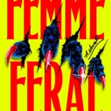
For Tim Ward’s Scavenger series I had a synopsis and excerpts, and I decided to do an interpretation of his main protagonist. I don’t think he had any idea I was going that route—I didn’t either at first—but he liked it so I guess I did pretty well.
If I’m doing a purely design-oriented cover, I like to have at least a synopsis and maybe the overall feel of the story to better match the cover with what is inside.
ASM: Do you need to change your approach or thinking these days with the prevalance of e-books, some of which will only render your work in monochrome? I often wondered how graphic designers felt about the switch from 12 inch album covers to the tiny CD format , which is something else that makes me ask the question.
SK: eBooks were already a big deal when I got started in the book world, but I haven’t had to do anything differently other than sizing covers for them. I do wish that it were easier to transfer the interior design of a book to its eBook counterpart—I have a lot of joy for the interiors.
Records are making a comeback. I’d assume the same method is at work there: design for the biggest product and then scale down.
ASM: Who are some of the favourite artists with whom you’ve worked?
SK: The first project Joe Martin brought me on with was Blackguards, and I got to work with Arman Akopian’s beautiful art. I love pretty much anything he does. He also supplied the illustrations for Kenny Soward’s GnomeSaga trilogy.
Alex Raspad is another awesome artist—he did the illustrations for The Ties That Bind trilogy from Rob J. Hayes, the forthcoming The Testament of Tall Eagle from John Fultz, the Black Raven books from Seth Skorkowsky, and Mark Tufo’s Lycan Fallout series.
And I have to mention Joe Martin himself. We make a pretty awesome duo.
ASM: What projects have you got forthcoming?
SK: I just finished up the covers for Ragnarok’s next big Kickstarter campaign for MECH: Age of Steel, an anthology edited by Tim Marquitz and N.X. Sharps, which will be launching later this year. I’ll be putting together Genius Loci, the latest funded Kickstarter anthology from Ragnarok and Jaym Gates, soon. I’ve got cover art out for approval on a project outside of Ragnarok, but I can’t disclose that information right now. I’m also working with Marc Tassin on Aetaltis, a Pathfinder Compatible RPG—I’m doing the RPG cover design, and the design/interior layout for the follow-up anthology Champions of Aetaltis.
ASM: Finally, do you have any particular ambitions as a designer – something you’d love to do or achieve in the future?
SK: It’s been less than a year since my biggest achievement as a designer—breaking into the book world—so I can’t think of anything I’d love right now, other than to grow with Ragnarok.