No. I’m not talking about kinky sex, BDSM, or E. L. James’ novel. I’m talking about painting in black and white.
I’ve blogged about painting with limited color palettes before but I wanted to examine some of the science fiction and fantasy art that is painted specifically in grayscale. That is, artwork that is painted using only values between black and white.
 What is value? Value is defined as the relative lightness or darkness of a color — in this case the color is black. Value defines form and creates spatial illusions. Contrast of value separates objects in space, while gradation of value suggests mass and contour of a contiguous surface.
I’m differentiating between painting and pen-and-ink illustration. While pen-and-ink can produce tones and shades through certain effects (stippling, hatching, etc.) the technique is kind of a binary state. You have the black of the ink and the white of the paper. It’s either on or off. Tones are created through effects, but the actual application of ink to paper remains the same.
Artists illustrate in grayscale for various reason but mostly it is to accommodate the printing process. Most magazines had interiors that were reproduced in black and white. This was an economical consideration. Glossy covers attracted but the guts of a book or magazine were printed in black. Thus the need for black and white illustrations.
 Just like in cinematography, black and white illustrations have to be designed to emphasize contrast in order to suggest form. The older pulps worked better with pen and ink illustrations because the stark contrast between the black and the white (or in this case the dirty off white of the pulp paper) reproduced better with the simple printing process. The more upscale publications, the “slicks” printed on a better grade of paper and usually ran on better presses. Although still black and white they could take advantage of the subtle range of grayscale values to present images.
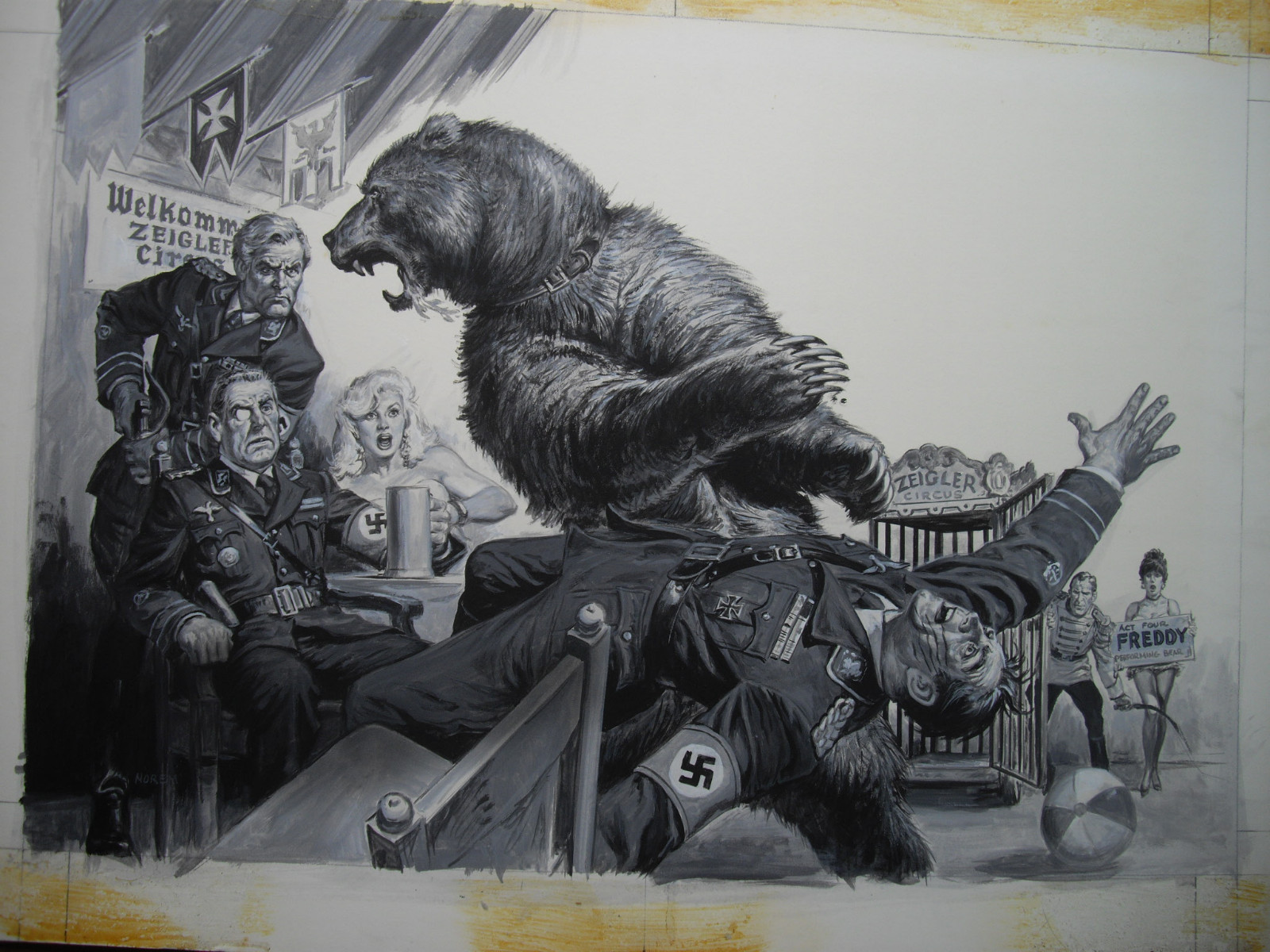
Thus you ended up with artists who could produce paintings or gray washes with as much subtlety and power as their color work. Artists like Mort Kunstler, Norman Saunders, Earl Norem and Walter Baumhoffer could produce dramatic images in grayscale that rivaled any of their full color work. In some cases their black and white images had more impact. The directness of the grayscale allowed them to concentrate on form and lighting effects.
 One of the masters of this kind of illustration was N. C. Wyeth. Although masterful with full color illustrations, Wyeth was a master of the monochromatic image. His black and white illustrations for classic books such as Treasure Island, Kidnapped, Robin Hood, The Last of the Mohicans and The White Company are marvelous to look at even today. They are powerful illustrations, pieces of tremendous beauty and craft. Although a master at black and white illustration, Wyeth eventually grew to loath the commercial aspect of illustration. “an illustration must be made practical, not only in its dramatic statement, but it must be a thing that will adapt itself to the engravers’ and printers’ limitations. This fact alone kills that underlying inspiration to create thought. Instead of expressing that inner feeling, you express the outward thought… or imitation of that feeling.” he wrote.
Despite his dislike for the limitations of the medium, his work within those limitations is more than outstanding and few equaled his mastery of the form.
 In 1977, Terry Brooks’ novel The Sword of Shannara was released as a trade paperback by Ballantine Books. It was a huge publishing event and the novel was touted as a worthy successor to The Lord of the Rings. At the time the look of Tolkien’s world was exemplified by the art of Tim and Greg Hildebrandt, so it was natural that Ballantine would task them with illustrating the book. While many of the paintings were done in color, several of the inner plates were only going to be reproduced in black and white. This gave the Brothers Hildebrandt the opportunity to walk in the footsteps of N.C. Wyeth and produce paintings in monochrome. Fully painted, some in acrylics, some in oils, the monochromatic images were fantastic illustrations. Even using only black and grays, the Brothers Hildebrandt showed off their supreme skills and, in the process, made The Sword of Shannara a great success.
Today there are very few science fiction magazines still publishing and only one of them, Analog Magazine, still features illustrations to accompany the stories. Because of advances in print technology black and white illustrations can be reproduced with a greater range of tones and values. Artists like Mark Evans and Josh Meehan produce sterling work in this most limited of limited palette painting.


M. D. Jackson has been drawing since he could first hold a pencil. He has been writing for so long that he has, in fact, developed an alternate personality named Jack to handle the fiction.
His work has appeared in numerous magazines and on the front covers of many books as well as in the pages of Amazing Stories Magazine. You can also see a lot of it at his gallery.