The first thing you will need to do is determine what size you plan to have your book printed at. Most trade paperbacks are 6”x9”, but CS (CreateSpace) offers many options. Just keep in mind that if your book is an unusual size, it may be hard to shelve and find for bookstores and shoppers. Once you have picked the size, you will need to open a new document, formatted to that page size, and ‘facing pages.’ I know for a fact that you can do this using Pages (Apple wordprocessing software) and InDesign (Adobe graphic design program) and I would assume you can do so with Word. This isn’t an article about how to use your word-processor, though.
Paste your document in from wherever you have it stowed (with back-ups, right?) and select the entirety of the document to make some tweaks. You will want to set the spacing to about 1.15 between lines, and do not put an extra line in between paragraphs. That is a convention only used for online content, not printed books. The text ought to be justified, in a readable font (serif is easier to read than sans-serif, generally), and 12-pt text is a normal font size. Tap the ‘end’ key, and take a look at the page count, maybe even make a note of it somewhere. This will dictate your spine measurements when you design the cover, and you will need it later in this process as well.
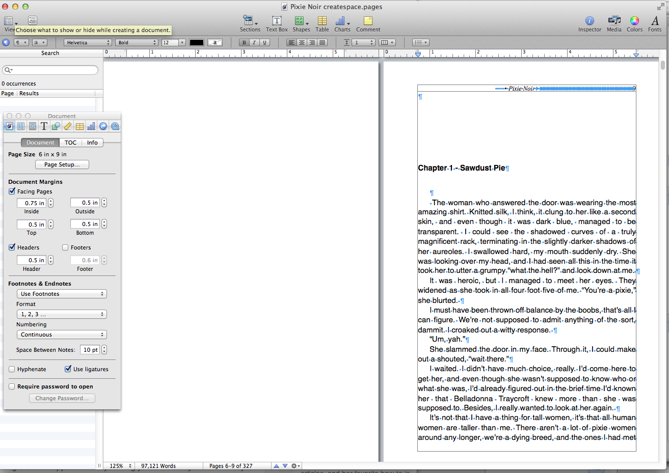
Between chapters, insert a section break, not a page break. Chapters ought to always start on the right-hand page, and section break will make sure this is the case. Formatting for chapter headings is best done by setting up a custom header. This should be something along the lines of 99 pt before the paragraph, and 24 pt after the paragraph to allow plenty of space, and you won’t need to remember how many enter strikes for 20-40 chapters.
In either the header or the footer, if you look at your example books as we did with the covers, you will see that a traditionally published book has the title on one side, author’s name on the other, and the page numbers. Whether you choose top or bottom is a matter of preference, but the eye naturally tracks downward while reading.
Check with CS’s recommendations. Customarily the outside margins to allow for bleed are set to .5 inches. The inside margin, the gutter, you can set in the layout area of your program, and it will be dependent on the page count of your book. CS offers a calculation where you plug in the page number, and it tells you the recommended gutter size. Err slightly larger than their minimum recommendation, or the last few letters on each line will be hard to see (again, check this when you get your print proof).
Your front matter ought to be a title page, with title and author name. Don’t use “by” here, that is implied. A well-designed graphic or symbol can look nice between them, but don’t use an image. Next page, with a section break so it appears on the right side, is your copyright and legal matter. Another section break, then other titles by author. In an ebook this is at the end, with embedded links to take readers directly to purchase them, but in a print book it is part of the front matter. Following with a section break is a dedication or acknowledgement page. Keep this short and simple, it should be no longer than a page, and preferably only a paragraph or two. If you feel you need more space, create an author’s afterword and put it at the end.
Modern novels, to my surprise, because I had stopped paying attention at some point, do not have a table of contents. After your front matter, insert section break, and the story (with chapter heading) begins. Resist any urges you may have to insert a glossary here, or cast of characters, or…anything except maybe a well-done map, if you must. If you feel that you need a glossary, put it at the end. A cast of characters is very old-fashioned, and no longer is considered necessary.
After the story is where (with section breaks!) any appendices, afterwords, or author’s notes go, I would also suggest an excerpt from another work, either the sequel if your title is part of a series, or an novel of similar genre. This has fallen from favor, but for a relatively unknown author, it’s a great way to let your new reader (who presumably has enjoyed your writing, having made it this far) know what else you have available.
Once you are happy with how your file is set up, save as a pdf, or export to a program that does that. Mine saves as pdf by exporting, I believe some programs only do so by starting the print process, then selecting ‘print as pdf’ so you may need to fool around with it a little until you find the way. Upload the pdf to createspace along with your cover file, and the review process begins. I find that even if it comes back flagged for ‘issues’ the most likely culprit is having page numbers in the wrong place, where they appear too close to the bleed zone. Double check this, and when it is ready, order a few proof copies. I do this because I can have more than one set of eyes on the proofs right away, and someone else may catch things I am no longer seeing after so long close to the project.