Today I am pleased to present a guest post by Eric Gustafson, an innovative artist and book cover designer. I am still learning so much about cover design, and as Eric has been one of the people who is teaching me (if he knows it or not!) I wanted you all to get the benefit of his ideas, and sparkling sense of humor, as well. He’s also offering a special deal right now, for indie authors seeking real art at affordable prices. I told him to promote himself in the post, but he was too modest to do it, so I will for him.
Part 1 of 2: Indie Book Covers
Gather ’round, class. Today we’re going to look at (ugh!) indie book covers, and how not to let that happen to you!
No, no–don’t let us jump to conclusions. Although I am a dreaded artist₋slash-writer myself, I am not telling you to go hire an expensive artist (necessarily). Here’s something unconventional you can do to make sure that your indie book cover doesn’t suck, or at least doesn’t suck *too* bad: get rid of the stuff on your cover.
The Terror of Typography
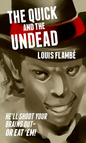
Thanks to the incredible human advancement of modern computer technology, it’s now pretty gosh darn easy to slap a layer of Comic Sans MS onto a chunk of art. Ah, once a little knowledge was a dangerous thing. Now, a little access to advanced tools is a dangerous thing.
No, I’m not a snob. Yeah, way back in the 80s, I spent all that time in class learning how to spec type and operate a stat camera and develop film and all that, and within a couple years Photoshop was introduced and flushed all that down the drain. But I’m not bitter! Noooo, not at all!
But there remains some skills that computers haven’t completely eradicated. Yet. Kerning type is one such skill. If you just typed your title in Gimp or Photoshop, as if it were just one more line in your word processor, your cover title probably looks awful. That drop shadow you tried adding–UGH! And how do you do a border around the letters? Don’t even do any of thas stuff until you’ve kerned. Computer fonts still aren’t perfect at spacing letters. I’m pretty close to perfect at kerning (brag), at least a cheesy kerning test I took online told me that I am, and why would I cheat on a cheesy online test?
You want to know my secret to kerning type? No, I didn’t think so. Why not just leave the title off the cover? No, I’m serious. I know I’m going against convention with this dangerous advice–they always tell you to make sure your title is HUGE so that people can READ IT really EASY in the THUMBNAIL!
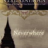
But why? In most cases, the title is right there in the accompanying ASCII sales pitch, in large, perfectly legible text, along with the synopsis and price point. Take, for instance, Colleen Doran’s remastered edition of A Distant Soil, brand new on Amazon. Her cover features an iconic image from the series, but no text whatsoever. For all I know, it doesn’t have text on the cover of the print edition, either. The book doesn’t need the masthead stamped on the cover to sell it, and not just because everybody knows A Distant Soil. The image is distinctive and says a lot about the kind of story she’s going to tell, inside the covers. And after seeing it once, you’ll likely remember what it is when you see it again, later. Once you learn the title, the art becomes a special language that spell out the title as nothing else can.
But what about those times the cover thumbnail appears offsite, say in an ad? Think about it–are people more likely to click on a thumbnail with colorful art depicting fantastic characters? Or a thumbnail that’s just A BIG BLOCK OF TEXT?
OK, you might counter: WOOL. To which I’d riposte: oh, darn you! But, seriously, if you’re any kind of writer or artist, you know this kind of thing is subjective as all get-out. Wool didn’t succeed or not because of the cover. The cover is largely marketing, and there’s a million different ways to do it. One kind of cover or other won’t *necessarily* kill your book, or save it. The important thing is to capture your potential reader’s imagination. You can do that with just text.
And you might have good reason to avoid art.
Part 2 will appear next week at this time, in this place… in the meantime, be sure to check out Eric’s blog, and contemplate covers and what they can do for your books – not just one, but branding, for a lifetime of production by you, in multiple genres. How will your readers know you and find you? How often do you remember an author or a publisher, rather than just a story?


2 Comments